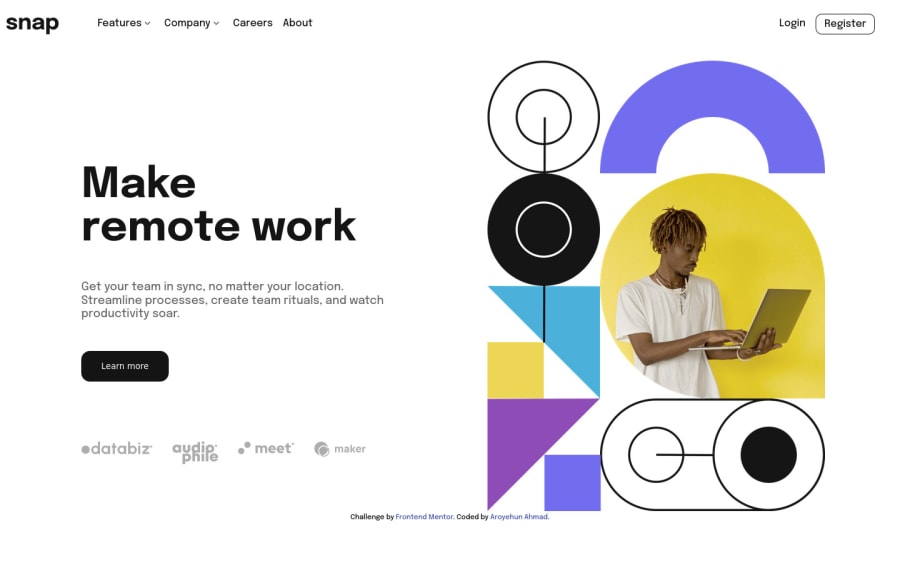
Design comparison
Solution retrospective
Why doesthe register btn and logo, change position if features or company dropdown is clicked?
Community feedback
- @elaineleungPosted over 2 years ago
Hey Ahmad, well done in building together this solution! To answer your question about why things shift when you click on the dropdown, it's because the dropdown has a
position: relative. That means that when it appears, its height is part of the header height, and so everything shifts according to that height change.To fix this in the desktop view, simply change the position property in
.dropdowntoposition: absoluteinstead and addposition: relativeto your.primary-navigation liselector, so that the browser knows which parent to anchor.dropdown.to in the positioning. You may also have to change theleftandtopproperties as you see fit. I'd also suggest adding awidth: max-content;to make sure the content takes the whole width and not need to be pushed to the next line. For the mobile view, be sure to keep thatposition: relativein the.dropdownwhen clicked, like how you had it.Hope this helps you out!
Marked as helpful1
Please log in to post a comment
Log in with GitHubJoin our Discord community
Join thousands of Frontend Mentor community members taking the challenges, sharing resources, helping each other, and chatting about all things front-end!
Join our Discord
