Submitted 7 months ago
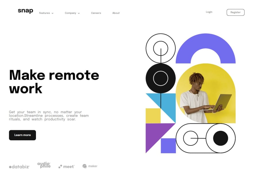
Intro section with dropdown navigation | Including mobile view as well
@Dubidimi
Design comparison
SolutionDesign
Solution retrospective
What are you most proud of, and what would you do differently next time?
I am proud of finally designing layout for mobile phones as well. I tried in previous project but it didn't come out as it should have. So, I'm glad I achieved that. One of the developers commented on project recommending that I shouldn't use grid because it will cause problems. He was right and with his recommendation I achieved this beautiful design. If u r reading this thanks my G.
What challenges did you encounter, and how did you overcome them?ok
What specific areas of your project would you like help with?ok
Community feedback
Please log in to post a comment
Log in with GitHubJoin our Discord community
Join thousands of Frontend Mentor community members taking the challenges, sharing resources, helping each other, and chatting about all things front-end!
Join our Discord
