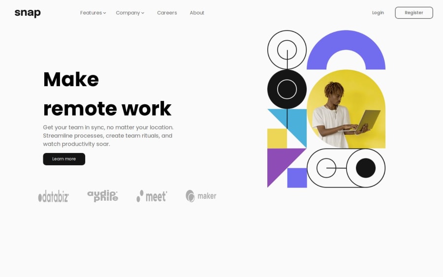


Design comparison

Solution retrospective
I'm most proud of how I structured my code to be clean, reusable, and maintainable. I focused on writing semantic HTML, optimizing CSS with utility classes, and keeping my JavaScript modular. Additionally, I ensured my project was fully responsive across all devices and followed best accessibility practices.
Next time, I would spend more time optimizing performance, such as lazy-loading images and minimizing unnecessary re-renders in React. I would also explore using a CSS framework like Tailwind or integrating animations to enhance the user experience. Lastly, I’d like to improve my testing workflow by incorporating unit and integration tests.
One of the main challenges I faced was ensuring full responsiveness across different screen sizes, especially when dealing with complex layouts. I also encountered some difficulties in maintaining consistent styling while keeping my CSS manageable.
To tackle responsiveness, I used a mobile-first approach and leveraged CSS Flexbox/Grid effectively. I also tested my design on multiple screen sizes to fine-tune breakpoints. For styling consistency, I utilized reusable utility classes and considered using a CSS framework like Tailwind. Additionally, I referred to the project’s design specs frequently to ensure pixel-perfect accuracy.
I'm looking for feedback on my code structure and best practices. Specifically, I'd love insights on how to improve code readability, optimize performance, and enhance accessibility. Additionally, any suggestions on improving responsiveness and handling complex layouts more efficiently would be greatly appreciated!"
Community feedback
Please log in to post a comment
Log in with GitHub
Join our Discord community
Join thousands of Frontend Mentor community members taking the challenges, sharing resources, helping each other, and chatting about all things front-end!
Join our Discord