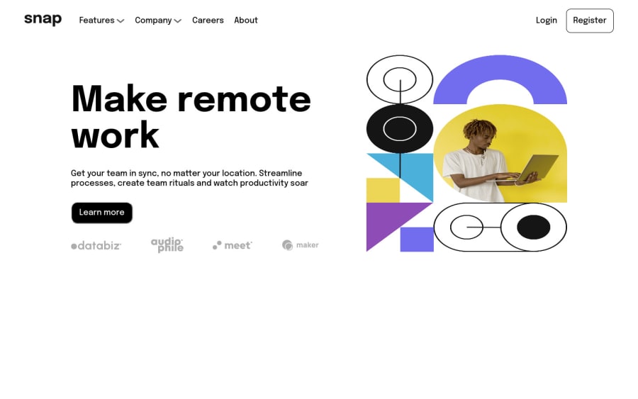
Design comparison
Solution retrospective
Hello,
this is my fourth commit. This time a guess i've implemented 90% of JS functionalities and the project just need some minors adjustments in CSS. But major objectives like "navbar functionality", "feature/company open-close" it is there.
I know there would be better ways to construct the layout and the code, but that's it! I hope you enjoy it
Community feedback
- @iamenochleePosted over 2 years ago
congrats on your solution, you can still apply some padding and margin changes to it, the image looks streched, this is due to the fact that you applied a height to it, avoid appling heights to images, use the width property only, you can always update your solution once you get your javascript going. I hope this helped you out. Keep coding;
Marked as helpful0@andykallianPosted over 2 years ago@iamenochlee thank you buddy! I'm going to remember this tip! Keep coding!
1
Please log in to post a comment
Log in with GitHubJoin our Discord community
Join thousands of Frontend Mentor community members taking the challenges, sharing resources, helping each other, and chatting about all things front-end!
Join our Discord
