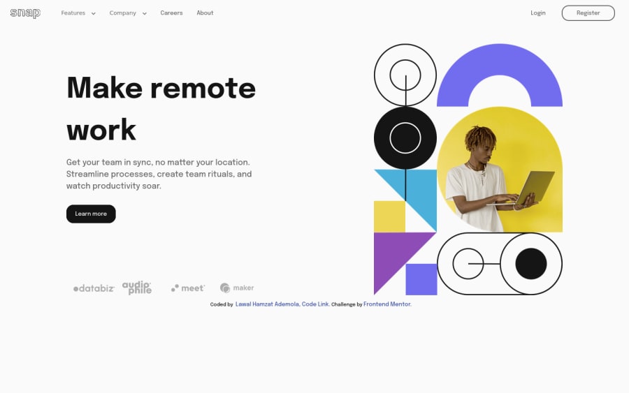
Intro section with dropdown navigation challenge using HTML 5 Semantic
Design comparison
Solution retrospective
Hello my Lovely Developers, This is my solution to the Intro section with dropdown navigation challenge using HTML 5 Semantic tags, CSS 3, SASS(SCSS syntax) and javaScript, Here are some of the Extra things I added
- My navigation links and image hover style on desktop:<br/> I use javaScript mouse-tracking to add a dark circle behind each nav links and the dark circle follows the, the same is done on the image using grayscale backdrop
- I used SVG for the text/logo "snap" and animates it.
Here are my questions:
-
do you think I use the HTML 5 Semantic tags correctly?
-
do you think it's a good idea to always use ID only to select element from the javaScrip without a special reason(I mean for DOM manipulation)?
-
please do you know why the skip to main content isn't showing on firefox browser?
-
Is it inaccessible in anyway or Is there any accessibility feature you think I should add?
-
in what aspect of my code do you think I should Improve on?
-
Is there anything I did that you have a better way of doing?
-
what do you think of my code? is it clean? Kindy tell how I can Improve that?
-
do you notice any details left out in the design and How do think I can fix it?
Community feedback
- @grace-snowPosted over 2 years ago
I've had some more time to look at this code now
- You don't need aria-label on the menu toggle if it already says menu inside
- BUT this is not how you write a visually-hidden class!
font-size: 0;. That will be inaccessible. Look up the correct CSS snippet you need there - Whenever a link / section of content is hidden off screen (like the nav ul on mobile, or dropdown content on each of the nav items) it must be visibility hidden with CSS. Otherwise keyboard users can tab into the hidden content
- You don't need to add visually hidden text to nav items like "About". Changing that to "about us" only for some users will make it inaccessible to others. When developers do this poor practice it is called over-engineering.
- The way you are using padding in your layout like on main and its children is really strange. You don't need any of it. Instead, use techniques like max-width for the content, margin auto to center it, and as you are using grid it's even less needed! Never add padding to grid children to change the layout like this, that is what the grid template is for. You already have things like gap for the space between grid children, and then you don't need the extra 'inner divs' wrapping the content thats inside each grid child. You're making this more complex than it needs to be.
- I don't think those company logos are decorative. They are important content showing clients who use the software, so should not be aria-hidden and should be labelled properly, possibly even with a visually-hidden heading
- Paragraph line length should never be able to exceed 80ch
- Some of the text is TINY on mobile. Does it even need changing? Not usually.
- It is usual to have a wrapper class that sets the max width for content, and some padding on the sides and margin auto on the sides. You can then use this class wherever it is needed throughout a project, at whatever level in the DOM you need. This is much better than setting some side padding on one element (nav) and then side margin on other low level elements (like paragraph). Paragraphs and headings will almost always only need vertical margins.
Marked as helpful2@EngineerHamzieyPosted over 2 years ago@grace-snow thanks so much 😊this is priceless
I knew you were busy when you made the first comment. Thanks 😊😁
0 - @vanzasetiaPosted over 2 years ago
Hi, Hamzat! 👋
Good to see you completing another challenge!
I like the animations that you created for the mobile navigation and it would be better if the users can control the animation. It means that if the users don't want to see any animations, they can turn them off. It's possible by using
prefers-reduced-motionmedia query.I created "5 Handy Sass Code Snippets" article. In that article, you will find some useful
@mixinto help you write Sass. 🙂Also, I would not recommend hiding the brands. I think the purpose of the section is to show the clients that have used the product. So, it should have alternative text and not be hidden from users of assistive technology. I might give a visually hidden heading to give some structure to the page (
<h2>Clients</h2>).I hope this helps! Happy coding!
Marked as helpful1 - @grace-snowPosted over 2 years ago
The animations are really glitchy on this, it makes it all look a bit broken... Clicking the nav toggle makes it jump position and nav items don't seem correctly aligned like the design.
Don't forget to adjust line height too so things like the heading match the design
Marked as helpful1
Please log in to post a comment
Log in with GitHubJoin our Discord community
Join thousands of Frontend Mentor community members taking the challenges, sharing resources, helping each other, and chatting about all things front-end!
Join our Discord
