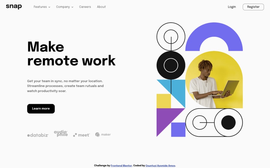
Design comparison
Solution retrospective
Is there any area I overlooked?
Community feedback
- @elaineleungPosted over 2 years ago
Hi Amos, I think you did a great job overall! There are several parts in this challenge that can be tough to put together, but I think you managed to make it work and also to make it look very close to the design. One thing I found was, the dropdown navs work well in the desktop view, but in the mobile view, I tried using touch simulation and also normal mouse clicking to open the dropdown nav, but they wouldn't open. Also, I see that you have a class named
.arrow-upand another named.arrow-upp; I don't know what the difference is, but it could get confusing; my suggestion is just to write a descriptive word that describes whatuppis doing. Once again, great work with this challenge 🙂Marked as helpful2@fisttyPosted over 2 years ago@elaineleung Thanks for your feedback. Got the mobile nav to work now and changed the class name.
1 - @hebrerilloPosted over 2 years ago
Good job Amos!! I am impressed by your work.
Just a small remark. If you resize the browser to 375px wide (IPhone), you will realize that the links of the footer (databiz, audiophile...) are kind of too big. Much bigger compared to the design. I tell you this because I also ran into the same mistake with this challenge.
Also, as Elaine stated, the drop-down sub-menus do not open using a touch simulation.
Marked as helpful1@fisttyPosted over 2 years ago@hebrerillo I appreciate the feedback. I just got the images to display better now.
1@hebrerilloPosted over 2 years ago@fistty as I said, it was just a small remark. The rest of the implementation is amazing!
1
Please log in to post a comment
Log in with GitHubJoin our Discord community
Join thousands of Frontend Mentor community members taking the challenges, sharing resources, helping each other, and chatting about all things front-end!
Join our Discord
