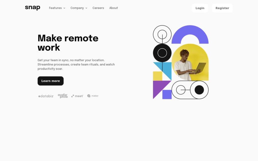
Design comparison
Solution retrospective
Hi ALL,
Even this just a junior project, I still have a lot of questions to ask, hope you guys can help me out. Thanks!!! (P.S. I make this project mobile-first and not fully RWD, just using breakpoints from style-guide)
- When I try to move the meun out of the screen by using transform: translateX(100%), why the height of the container increased accordingly?
- I fixed this by adding overflow: hidden to the container.
-
I tried to do some transition when appearing the submeun, I fix the display:none to display:block problem by setting offsetHeight (to force the element recalc the height and do the transition, do I get this right?) but it dones't work when I try to turn it off, submeun just disappear without any transition. Is there any way to do that?
-
Since the meun button of the mobile view is made by pseudo-element, I can't change it by JS, is there any way I can have the tranisiton from burger meun button to close button instead just switch between them?
Besides my question, any suggestion and feedback is more than appreciated. Thanks!!
Community feedback
Please log in to post a comment
Log in with GitHubJoin our Discord community
Join thousands of Frontend Mentor community members taking the challenges, sharing resources, helping each other, and chatting about all things front-end!
Join our Discord
