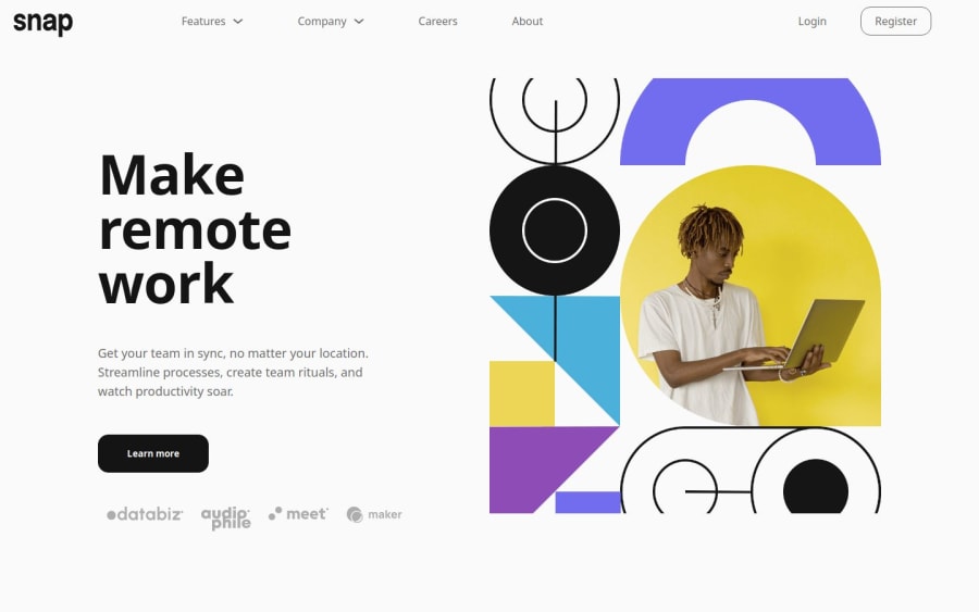
Intro section with dropdown navigation


Design comparison

Community feedback
- @khatri2002Posted about 2 months ago
Hi @aouintihouari!
The developed solution looks great! Below are some suggestions for improvement:
1) Fix Extra Space in Footer Images
The client images under the
<footer>have extra left space, making them misaligned with other elements.
The text, button, and images should all have the same left alignment as per the design reference.You're using
justify-content: space-around;, which adds spacing on both left & right sides.Fix:
.footer-container {
  display: flex;
  justify-content: space-between; /* Instead of space-around */
}
Now, the left margin is consistent across all elements.
2) Use One
<nav>Instead of TwoYou're using two
<nav>structures (one for desktop and one for mobile).
While this works, it's not best practice.
Normally, a single<nav>should be responsive using CSS media queries.Instead of duplicating HTML, hide/show elements based on screen width using CSS breakpoints.
Why is this better?
- Avoids HTML duplication
- Improves performance & accessibility
- Enhances CSS skills
Keep up the fantastic work! 🚀
0

Please log in to post a comment
Log in with GitHub
Join our Discord community
Join thousands of Frontend Mentor community members taking the challenges, sharing resources, helping each other, and chatting about all things front-end!
Join our Discord