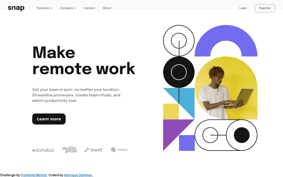
Design comparison
SolutionDesign
Solution retrospective
Hi everyone
Here is another chalenge completed!
If you have any tip or advice, please leave a coment
Community feedback
- @arshGoyalDevPosted over 2 years ago
There are a quite a few issues in your solution,
- It's not responsive.
- There is no navbar for small devices.
- Logo section is overflowing on the learn more btn.
- When one dropdown menu is open and I try to open another the previous should be automatically closed.
- The box shadow of the dropdown menu should be smooth, it could be something like this
box-shadow: 5px 5px 40px rgba(200, 200, 200, 0.4)
Marked as helpful0 - @TobifunmiPosted over 2 years ago
Hello Henrique
Kudos on a job well done. The solution looks fantastic. I noticed that your image was stretched and this is because you have it a
widthand aheight. I believe that justwidthwould have been fine.1
Please log in to post a comment
Log in with GitHubJoin our Discord community
Join thousands of Frontend Mentor community members taking the challenges, sharing resources, helping each other, and chatting about all things front-end!
Join our Discord
