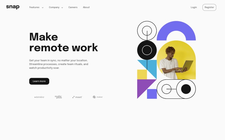
Intro Section With Dropdown Nav - HTML/CSS/JS
Design comparison
Solution retrospective
Struggled a bit with repeated/redundant HTML code on this. Still trying to do these challenges without diving into React, I'm sure it would be a much cleaner codebase with reusable components.
I'm unsure whether I should be utilising CSS grid as well as flex, right now I'm exclusively using flex.
Community feedback
- @pradeeps4iniPosted over 2 years ago
Hey. Good work. You should use whatever you're comfortable with flex or grid. But learn both. Grid can be used to design the macro layout (how your page looks), where as both flex and grid can be used to design micro layout (each distinct element).
You nav toggle shows and hide suddenly. You should give some transition to it. Learn about transform and transition. It will look much better.
You have used JS to toggle the nav in mobile layout. Learn to do it with css only. It will be a great learning exercise.
Marked as helpful0@jtubbenhauerPosted over 2 years ago@pradeeps4ini Thank you very much for your feedback. Much appreciated!
0@pradeeps4iniPosted over 2 years ago@jtubbenhauer You're welcome dude. We are all in this together. Learning to be better devs.
0
Please log in to post a comment
Log in with GitHubJoin our Discord community
Join thousands of Frontend Mentor community members taking the challenges, sharing resources, helping each other, and chatting about all things front-end!
Join our Discord
