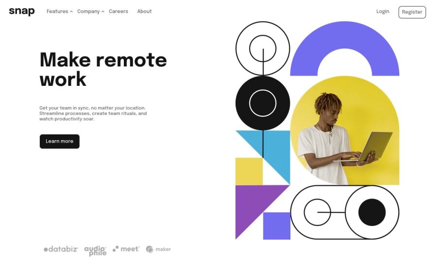
Intro section with dropdown nav by mouseover/mouseout event listener
Design comparison
Solution retrospective
The way I made this, I had two different navs - one for mobile view, and one for desktop view - which I styled individually. I would like to know if there is a better approach to this challenge(there probably is). Also, should I have used a specific tabindex or just left all as 0? If anyone could help me with these, it would be highly appreciated. Thanks!
Community feedback
- @elaineleungPosted over 2 years ago
Hi Tobani, well done in working on this, and I think the way you solved the problem was quite a creative one, even though there may be better approaches. What I did in my solution is to use the same nav bar, and I had it inside the
header
, so that that header would contain the logo and my nav. For the mobile view, I gave the nav bar aposition: fixed
property so that it could be fixed to a point on the screen, and at the desktop view, I had it atposition: relative
so that it could be part of the header again. To see what I mean, you can check out this CodePen I wrote as a draft/practice for this challenge: https://codepen.io/elaineleung/pen/poLpzge.About the
tabindex
, if your intention for using it is so that the tab key can be used with the elements, then firstly you need to see whether it is necessary to usetabindex
for that element at all. If the element is a link (<a>
) or an input/button, they already have an inherent control for tabbing and there's no need fortabindex
; the only thing you need to do is make sure there's a focus style for that element because often times we would remove the default focus style. If the element is not one of the control elements (let's say it's a div) but you want it to be interactive for some reason, thentabindex='0'
is what you can add as an attribute. We typically do not use numbers more than 0 as that would confuse the screen reader. I see that you've got a whole bunch of accessibility issues due totabindex
, mostly because of the links, which don't need anytabindex
. I think you can remove thosetabindex
attributes; instead, just see whether those links have a focus style. Be sure to look into all the other accessibility/HTML issues as well!Marked as helpful0@TobshubPosted over 2 years ago@elaineleung Thank you so much for this! I will correct the accessibility issues and then look at your solution.
0
Please log in to post a comment
Log in with GitHubJoin our Discord community
Join thousands of Frontend Mentor community members taking the challenges, sharing resources, helping each other, and chatting about all things front-end!
Join our Discord