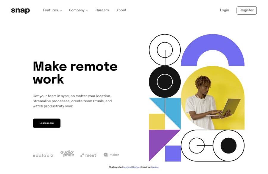


Design comparison

Solution retrospective
Had a lot of fun building this, if you know what I mean. feedback is welcomed.
Community feedback
- @elaineleungPosted over 2 years ago
Hi Gideon, great job with this challenge! I just checked it out, and it looks like around the 600px breakpoint when it switches to desktop view, the contents in the nav bar appear and are all squished, as well as the main content below. I would suggest keeping the mobile nav until a higher breakpoint. For my solution, my breakpoint for switching the main content was around the 800px, and my nav didn't switch until around 960px I think.
Once again, well done!
Marked as helpful1@Olumide2596Posted over 2 years ago@elaineleung Thank you, I'll do just that
0 - @NJVSPosted over 2 years ago
Congrats, your solution looks really good. But there's a small problem, the dropdown menu is still clickable even though its not visible, I suggest to add css property
visibility: hidden/visibility: visibleon dropdown menus becauseopacityonly makes the element transparent.Marked as helpful0


Please log in to post a comment
Log in with GitHub
Join our Discord community
Join thousands of Frontend Mentor community members taking the challenges, sharing resources, helping each other, and chatting about all things front-end!
Join our Discord