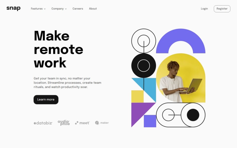
Intro section with accessible dropdown navigation using SCSS
Design comparison
Solution retrospective
I found the greatest problem on this challenge was drawing the line between doing everything in CSS vs. shifting some of the load over to JavaScript in favour of reliability/simplicity. I'll need to do more practice and reading on some common progressive enhancement techniques as I've known about the concept for a while but never dove too deep into a lot of common use cases.
I think the accessibility & screen reader experience is good on this challenge and I've made sure to implement the previous accessibility feedback from my other solutions.
Happy to hear any feedback, but a few items I'm particularly keen in hearing about are below:
- How do you approach progressive enhancement to critical elements like navbars, and how do you balance code complexity as a result of that?
- Are advanced techniques like detecting user agents or lots of polyfills employed often?
- Accessible names for elements - are mine too vague or verbose? I tried to follow the ARIA guidelines as much as possible when adding and reviewing these.
- With my nav menu buttons, I've set both to be aria-expanded when the menu opens/closes - is this the right approach?
- I have the "open nav" button positioned above the link content, and "close nav" button positioned after the content - I couldn't find definitive info on this being wrong, so I'm assuming this is up to interpretation based on context of the menu structure & assistive tech user preference?
- I've used preloading for the first real time on this to speed up loading of the hero images for CLS & LCP advantages, but would you be preloading CSS/fonts often as well, or only in specific scenarios?
Community feedback
Please log in to post a comment
Log in with GitHubJoin our Discord community
Join thousands of Frontend Mentor community members taking the challenges, sharing resources, helping each other, and chatting about all things front-end!
Join our Discord
