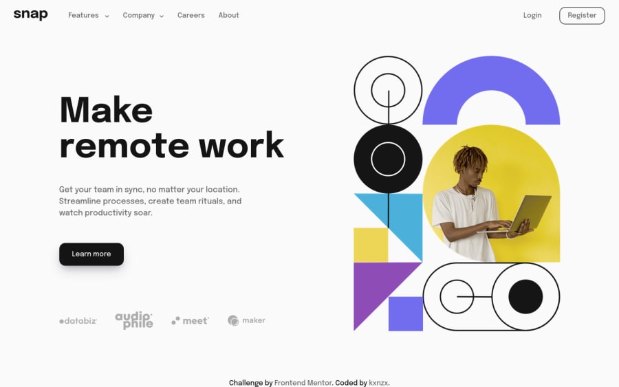
Intro Dropdown Navigation with Vanilla JavaScript
Design comparison
Solution retrospective
What I learned:
It was surprisingly fun to work on this challenge. I have gained some insight about JavaScript if/else statements and the CSS z-index property.
There are some conditions for the z-index to work:
- it only works on positioned elements such as position:absolute, position:relative, or position:fixed
- avoid using negative values (links won't work anymore when they are on a lower index level with a negative value)
- only use the z-index on the specific element
- avoid using min-height: 100%; on the element that is supposed to be on a lower index level
JavaScript if/else statements:
The if statement tests if a specified condition (which is in between () parentheses) is true or false (these are boolean values). In the boolean data type, there are only two possible values that can be returned: true or false. If the specified condition is true, then the block of code (which is in between the {} curly braces) will be executed. If the specified condition is false, then the block of code will be skipped.
Summary:
- Use if to specify a block of code to be executed, if a specified condition is true
- Use else to specify a block of code to be executed, if the same condition is false
- Use else if to specify a new condition to test, if the first condition is false
- Use switch to specify many alternative blocks of code to be executed
Community feedback
Please log in to post a comment
Log in with GitHubJoin our Discord community
Join thousands of Frontend Mentor community members taking the challenges, sharing resources, helping each other, and chatting about all things front-end!
Join our Discord
