Design comparison
SolutionDesign
Solution retrospective
Hi frontend Mentor Community!
this is my first junior challenge, so if you have tip/advice or feedback please tell me!
Community feedback
- @alosoftPosted almost 3 years ago
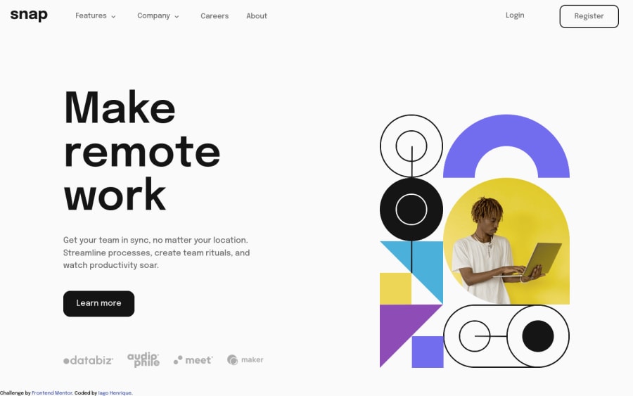
@iagohenrique2009 You did a good job but there is still some improvements you could make
- remove the blue color and underline from the navigation links
text-decoration: none;- Remove the width size from the text elements and also on the textcenter class on mobile
width: unset- Wrap and center the client container on mobile
    flex-wrap: wrap;
    justify-content: center;
Marked as helpful1
Please log in to post a comment
Log in with GitHubJoin our Discord community
Join thousands of Frontend Mentor community members taking the challenges, sharing resources, helping each other, and chatting about all things front-end!
Join our Discord
