Submitted about 2 years ago
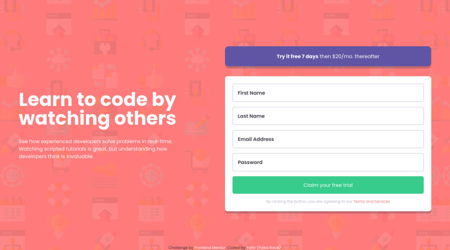
Intro Component With Signup Form using Tailwind CSS and CSS Grid
@YaikaRace
Design comparison
SolutionDesign
Solution retrospective
- I added a message when the password is less than 6 digits.
What I had the hardest time was detecting that the email was valid, detecting that no field was empty and using the CSS grid, I don't know if I did it right so any feedback is welcome!
Community feedback
- @hyrongennikePosted about 2 years ago
Hi @YaikaRace,
Nice job on completing the challenge
If you want to center the content and form in the middle of the page you can add the following.
flex flex-col items-center justify-center min-h-screenHope this is helpful.
0
Please log in to post a comment
Log in with GitHubJoin our Discord community
Join thousands of Frontend Mentor community members taking the challenges, sharing resources, helping each other, and chatting about all things front-end!
Join our Discord
