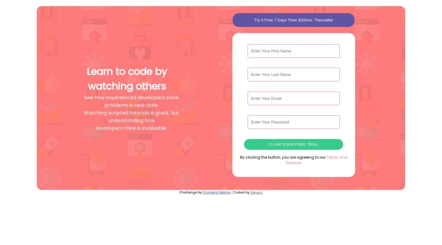
Design comparison
Solution retrospective
Hello My Name is Surya . Hope you guys doing well . Do check out my code and tell if any improvements can be made .
Community feedback
- @Bibiwei-PerePosted over 1 year ago
Hi, trust you day is going well and Congratulations on completing this challenge.
I noticed your design is not responsive on different screen sizes. The reason it's because you did not use media queries. Your gave your main a width of 1200px, it'll display perfectly on laptop because the size or resolution is greater than 1200px. So, what of devices like mobile phones whose screen sizes are lesser than 1200px?
Therefore to make it responsive you add Media queries and any CSS added within this media queries will only reflect in the screen sizes specified. For example
@media (max-width: 890px){
   main{
      max-width: 500px;
      width: 100%;
      flex-direction: column;
      }

     h1{
      color: blue
      }

    .form{
      max-width: 350px;
      width: 100%;
      }

      *And so on*

}
All the changes made above will only appear on device lesser than 890px in size or resolution.
Overall, you did a great job 👍
Hope you find this helpful
Marked as helpful0
Please log in to post a comment
Log in with GitHubJoin our Discord community
Join thousands of Frontend Mentor community members taking the challenges, sharing resources, helping each other, and chatting about all things front-end!
Join our Discord
