Submitted over 3 years ago
Intro component with sign-up form using FlexBox
@DineshrajAnandan
Design comparison
SolutionDesign
Solution retrospective
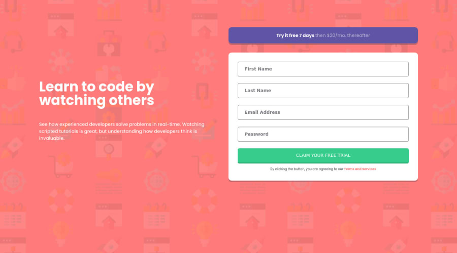
Hey everyone! I've just completed this challenge.
Any feedback and suggestions on how I can improve are very welcome! Thanks!
Community feedback
- @mickygingerPosted over 3 years ago
Hey Dineshraj!
You've done a great job on this well done! 🎉
On desktop the design is quite stretched. I would recommend setting a
max-widthon the.containerelement, so that it never stretches too far. You'll then need to center the.containerinside the body. Something like this should do the trick:body { // existing styles display: flex; justify-content: center; } .container { // existing styles max-width: 1200px; }Hope that helps!
0@DineshrajAnandanPosted over 3 years ago@mickyginger Oh yes! I will correct it. Thanks for the feedback!
0
Please log in to post a comment
Log in with GitHubJoin our Discord community
Join thousands of Frontend Mentor community members taking the challenges, sharing resources, helping each other, and chatting about all things front-end!
Join our Discord
