Intro Component with Signup Form | HTML CSS Sass JS
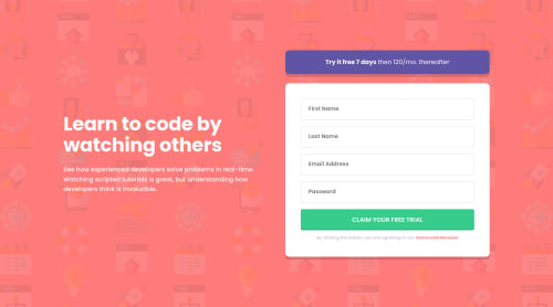
Design comparison
Solution retrospective
I've done another challenge! 🎉
It's hard to find the exact RegEx that I want to validate user inputs. For the email RegEx, I already created by myself so I did just copy-paste from previous solution. For the name RegEx, I created a RegEx where the user's first name and last name should have at least a vowel letter and two characters long. Password RegEx that I wanted was difficult to find. However, I finally found a gist that contains the password RegEx that I wanted.
I added two new features such as
- Users are able to toggle the password visibility so they can see what they've typed.
- Users can see the password length so they don't have to count it by themselves.
These features were added based on my users' stories.
I have no questions however, any feedback is appreciated.
Any questions on the technique that I'm using are welcome! 😁
Also, if you have finished this challenge and would like me to give feedback on it, please include a link to your solution. I would be glad to help you! 😀
Thanks!
Community feedback
- @brasspetalsPosted over 2 years ago
Hi, Vanza! 👋
I have no helpful, constructive feedback for you. Just wanted to drop in and let you know that your solution is fantastic! I really love the added features and like how you styled the attribution like the form. Thank you for the link to the password RegEx. 🙌 I also appreciate all the effort you put into your README files (my own are rather shabby...😅).
As always, look forward to your next solution! Hopefully, one of these times I'll actually have some useful input. 😄
4@vanzasetiaPosted over 2 years ago@brasspetals Hello Anna! Thank you for taking the time to see my solution! Your kind words boost my motivation so thank you for that! 😍
2 - @comendrunPosted over 2 years ago
Hi Vanza. thank you for your helpful feedback and comments that you write on your projects. I learned a lot from them and also they helped me guide my attention to the right place. Here's my solution, it's not as complete as yours, but I tried and spent a good time on it :
https://www.frontendmentor.io/solutions/intro-components-using-html-cssflexbox-also-javascript-validation-LbAIqzOu9e
1@vanzasetiaPosted over 2 years ago@comendrun No, problem! Hope my feedback helps!
0 - @jonathan401Posted over 2 years ago
This was a fantastic solution. I learnt a lot. I'm still working on this challenge now and the little note you added about not focusing much on achieving pixel perfection was a great tip for me because I've been struggling to make my solution match perfectly with the design 😄. Could you recommend any resource that'll make me better at making my projects more accessible? Because there just seems to be a whole lot of rules in making our projects more accessible 😁.
0@vanzasetiaPosted over 2 years ago@jonathan401 Thank you for taking the time to see my solution! Also, thanks for your kind words! I really appreciate it! 😍
Regarding your question, I think it's really hard to answer because a different project has a different way. Also, there are more than one ways to do things. So, I would give you some resources that I find useful for me.
- Avoid these common alt-text mistakes - The Big Hack
- Inclusive Components - learn how to create accessible components (toggle buttons, a todo list, etc).
- Blog Post by Adrian Roselli - Stop Giving Control Hints to Screen Readers
- Scott O'Hara - Blog Posts
- Andy Bell - Piccalilli
- Stephanie Eckles - moderncss.dev - I like the Modern CSS Upgrades To Improve Accessibility blog post. It tells you a practical guide to improve your website accessibility.
- Checklist - The A11y Project - a handy checklist to make sure that your website is accessible.
- WAVE Web Accessibility Evaluation Tool
The most important thing to learn about accessibility is it takes time to get good at it. So, keep learning, and feel free to use the resources that I share to help you learn about accessibility.
Good luck! 😉
1@jonathan401Posted over 2 years ago@vanzasetia Thank you!!. I'll certainly make sure to check those resources out
0 - @Muralidhar22Posted over 2 years ago
hey @vanzasetia can you please tell, what tools do you use to make it pixel perfect
0@vanzasetiaPosted over 2 years ago@Muralidhar22 I'm a PRO member so I actually make the solution private first and then try to make adjustments and then generate a new screenshot. This process repeats until I think that it looks similar to the design. So, there is a lot of "try and error" until it looks similar to the design. 😅
Also, I have the design file which makes it easier to at least make it looks similar to the design.
However, when I was not a PRO member, I didn't worry too much about making my solution as similar as possible to the design. I would prefer to have a nice HTML markup and stylesheet rather than "pixel perfect" solution.
Also, aiming to make the solution looks the exact same as the design was not helpful for me. It put a lot of pressure and sometimes made me write "weird" CSS like,
font-size: 0.97564rem
just for the sake of perfection. It's not possible either to make the site pixel perfect on all devices and browsers. Josh Comeau has written a great article about chasing pixel-perfect dreams which I recommend reading it.So, my recommendation is to focus on other more important things like web accessibility, writing low specificity CSS, writing nice JavaScript, etc. For me, if the site looks similar or even "pixel perfect" is just a bonus. 🙂
3
Please log in to post a comment
Log in with GitHubJoin our Discord community
Join thousands of Frontend Mentor community members taking the challenges, sharing resources, helping each other, and chatting about all things front-end!
Join our Discord