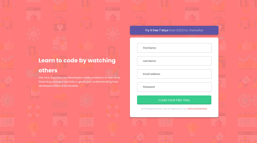
Submitted about 2 years ago
Intro Component with Signup Form | Flexbox & Vanilla JS
@justinnvera
Design comparison
SolutionDesign
Solution retrospective
How can I improve my mobile responsiveness? Especially my error messages and form container.
Community feedback
- @kartardeveloperPosted about 2 years ago
Hey Justin, You did a Great. But if you need some improvements I will help you with this. Here are some suggestions -- 1). You can increase your left heading font size and fix line height according to font size. 2). You can use input type submit for submitting the form and cursor: pointer; CSS property on your submit button. Everything else is looking good. I hope this will help you. If you need any help then I'm always there.👍
Marked as helpful1
Please log in to post a comment
Log in with GitHubJoin our Discord community
Join thousands of Frontend Mentor community members taking the challenges, sharing resources, helping each other, and chatting about all things front-end!
Join our Discord
