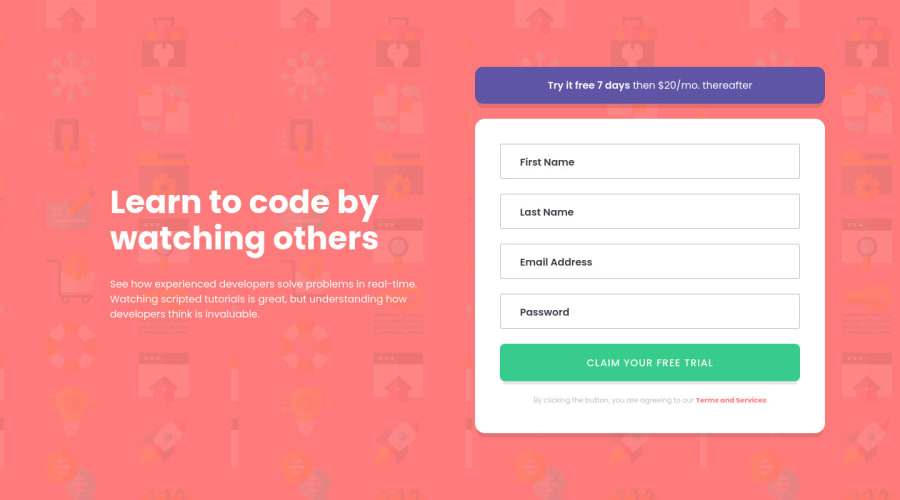
Design comparison
Solution retrospective
Putting labels inside the input field is a trend with material ui I think, but it adds a bit of complexity and reduces UX as labels are also what users can click to access the input field. I do not mind either way and it was first time trying this design.
For making errors, I was just so tempted to put 'required' field on input so that I don't have to manually print out errors on the page with JavaScript. Same with email, I just wanted to put 'type='email'' but I followed the template.
Sign-up form is one of the first components that user sees when he visits the website for the first time. It is crucial to be visually appealing and good on user experience. To look back, I only made a couple of login forms since I started web development journey. I think just doing a separate component practice is valuable as people only build sign-up form once per each website they build. It was not that easy and took me longer than I expected.
I ended up with a lot of repeating JavaScript codes, but I could not think of a better way at my level yet. I want to do more projects that involves JavaScript now. I am curious to find out other easier ways than manually selecting each error components and remove add hidden.
Community feedback
Please log in to post a comment
Log in with GitHubJoin our Discord community
Join thousands of Frontend Mentor community members taking the challenges, sharing resources, helping each other, and chatting about all things front-end!
Join our Discord
