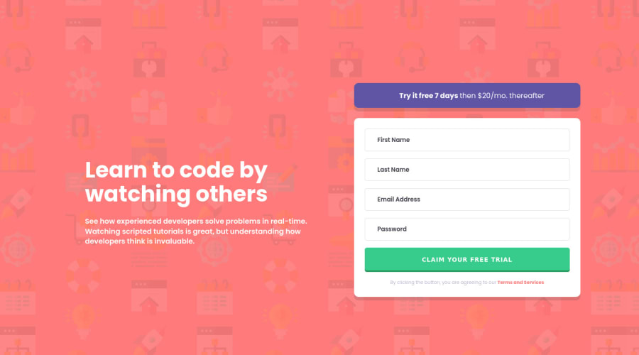
Design comparison
Solution retrospective
Answer as few or as many as you like. Thanks!
-
Tried to use clamp for the font size of the title, unsure if correctly, but it looks good to me, please tell me what you think.
-
Still unsure if I'm doing all right with grid, I set the columns to 56% and 44%, is that okay? Good practice? Can it be done any better? What about the template rows?
-
If you don't complete the email field and click submit, you'll see that the placeholder text is changed from 'Email Address' (set in CSS) to 'email@example/com' (in JS) however I couldn't figure out how to color it on the condition of the form being submitted. Any tips on that? Is there a better solution?
-
My JS is very clunky, I know. Any tips on how to improve upon that? I first thought about getting all the input fields based on a class selector but I know you're getting back different types of arrays with querySelectorAll and getElementsByClassName and wasn't sure about the logic coming after the iteration so I went the hardheaded way. Any JS tips are severely welcome!
-
Added the icons with absolute positioning relative to the form, which feels clunky too. Display: hidden, on click display: block. Any better way to do it?
-
What do you think about my class names? It's a combination of all the different naming conventions I went through today before starting out, but it's mainly BEM.
-
I've seen a use case for writing a data-error property on the input field and making use of that in the CSS with attr(data-error) as a before/after element's content, anyone heard of that before?
Community feedback
- @DavidMorgadePosted about 2 years ago
Hello Barney congrats on finish the challenge, great work on the responsiveness, the layout looks pretty good!
If you don't mind, I will try to answer your questions as far as my knowledge goes:
-
I'm not a personal fan of using
clamp()
but it is a great tool to manipulate your font-size without the need of hardcoding a lot of media queries, so I think using it for the font-size can be a great option. -
Your grid seems fine for me, it would probably be like 55% 45% or something like that, at least my eyes see that the text gets a tiny bigger space than the form. The rows are fine, you could have set your left section with the text as
grid-row: 1 / 3;
aligned to the center to match a bit more the position of the solution. You could also userow-gap
instead ofmargin
to separate theform
from the purplesection
. -
The problem with this (if I remember correctly) is that you can't select pseudoelements with Javascript because they are not part of the DOM, a workaround that some people do is to just remove the placeholder and use a
<span>
as a fake placeholder to select it with Javascript. -
There are a some things that could be refactored or converted to a less code or more readable code, but before I help you with this, I would say that on your very first projects of JS, the important thing is to get it working, the good practices and clean code will come with the time, you will never have the perfect javascript code because there will always be something that could be done better.
Here are some examples:
Refactor your if / else state as a ternary operator:
email.value.match(validRegex) ? true : false;
Use a
forEach
loop on your inputs by selecting all of them to check if they are empty or not, create a personal function for your email to check with the regex. Rapid example (not tested:)const inputs = document.querySelectorAll('.form__item'); const onSubmitHandler = e => { e.preventDefault(); inputs.forEach((input, index) => { if(!input.value) return; /* add validation erros here */ }) }
It would need to change a lot of things from your html and also JS to make it work in a foreach loop but it will certainly look better to read! and also less code!
-
Or you could just have set it as a positioned background image on the right side of the input!
-
The classnames are fine except for naming classes with just one letter like 'a' 'b' 'c' 'd', use something like error__icon--firstName error__icon--lastName...
-
Never heard of that, you could also use the html validations with a defined
pattern
on your input, but this for me is not a good solution since is less manipulable than getting yourself handling the validations.
Hope my feedback helps you! if you have any questions don't hesitate to ask, good job with the form !
Marked as helpful2 -
- @IlyaChichkovPosted about 2 years ago
Hi Barney, congratulations for this solution!
-Use the ::placeholder CSS pseudo-element for changing placeholder style. -You could simplify the validation JS code by separating the if body into a single function
function(el, n, b){ el.style.display = 'block'; n.style.marginBottom = '0'; n.style.borderColor = '#ff7a7a'; n.placeholder = ''; b.style.display = 'block'; }
-What about wrong input icons, I think it's better use visibility CSS property so that your elements were taken into account by the time page loaded and displayed when necessary.
Hope this will help with some of the questions.
1
Please log in to post a comment
Log in with GitHubJoin our Discord community
Join thousands of Frontend Mentor community members taking the challenges, sharing resources, helping each other, and chatting about all things front-end!
Join our Discord