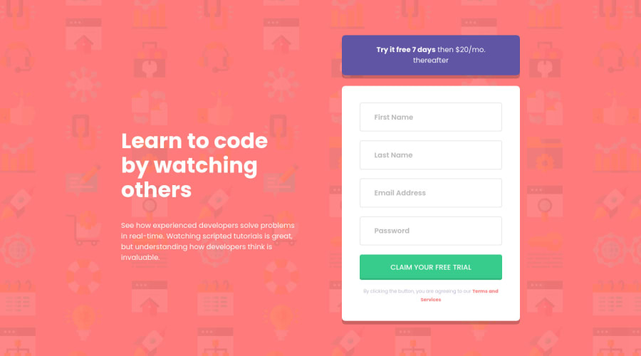
Intro component with sign-up form using SASS and BEM
Design comparison
Solution retrospective
Built with
- Semantic HTML5 markup
- CSS custom properties
- Flexbox
- CSS Grid
- Mobile-first workflow
- SASS
- BEM
- JavaScript and the Constraint Validation API
What I learned:
I learn most of how to use form validation. Using the Constraint Validation API was easy to write the validation message.
Suggestion? Any feedback is welcome!
Thank you.
Elio Flores
Community feedback
- @vanzasetiaPosted almost 2 years ago
Hi, Elio Flores!
I don't think you need to use a custom element for the Frontend Mentor attribution. You can use HTML and CSS to create it. My point is to not use JavaScript for something HTML can do. When HTML can't, use CSS. JavaScript should be the last resort.
Other suggestions:
<input>
withtype="submit"
is a legacy element. It was used before the<button>
element exist. It is best to avoid using legacy elements. So, use<button>
element instead.- Each
<input>
must have an accessible name or label. In this case, you can usearia-label
to label each input since there is no visible label. - Each error message should be connected with each
<input>
element. To do that, usearia-describedby
attribute. - Add
aria-live
attribute to each<input>
to make the error gets announced by screen readers as soon as the element is populated with the error message. - Add
novalidate
attribute to the<form>
with JavaScript. This way, if the JavaScript fails to load, the users get native HTML form validation. - Make the
<body>
element the container of the page instead of using<div class="container">
.
I recommend using
rem
for the font sizes. You want to useem
only when you want the size to be relative to the font size of the parent element.Dive deeper — rem vs em Units in CSS | DigitalOcean
I hope you find this useful.
0@eliofloPosted almost 2 years ago@vanzasetia Thanks for your feedback!
I started to learn about web accessibility but it still is not enough so I'm using axe-devtool and the accessibility report generator on FrontendMentor to check accessibility before submitting a solution. Your feedback motivates me to further study web accessibility to improve my understanding and implementation.
Regarding the custom footer, while it could be achieved using HTML, I chose to implement it as a web component in order to gain a deeper understanding and experience with this technology. Additionally, I intend to use this component in future FrontendMentor challenges as reusable components. I understand that the custom element may have added unnecessary complexity, and I appreciate your feedback in pointing this out.
Regarding the use of rem and em, I am still trying to gain a better understanding of when to use each one. I have previously used rem but received feedback suggesting that using em for resizing components in an independent manner is a good idea. While I understand the value of this approach, I have found it to be complex to apply as it requires careful consideration of which attributes depend on the
font-size
. I am continuing to learn and research this topic in order to improve my understanding.So I updated my solution if you could provide a code review, I would greatly appreciate it. Thank you for taking the time to provide feedback on my solution.
Elio Flores
0@vanzasetiaPosted almost 2 years ago@elioflo
You are welcome!
That's good to know that you are a browser extension to check the accessibility of the site.
That's a great reason to use custom elements. It's okay to try things out.
One thing that I notice is that you are setting 12 columns grid on the
.main
element. I think you should not do that for the layout. The layout is only a two-column layout. So, you should only need to set 2 columns grid.Marked as helpful0
Please log in to post a comment
Log in with GitHubJoin our Discord community
Join thousands of Frontend Mentor community members taking the challenges, sharing resources, helping each other, and chatting about all things front-end!
Join our Discord