

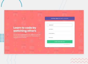
Design comparison

Community feedback
- @VenusYPosted 9 months ago
Great work, this is an amazing solution! Visually, it looks almost identical to the design, and the functionality is practically perfect.
One small thing I would point out is that there is no padding between the top and bottom of the viewport and the content on smaller screen sizes, which could detract from the user experience as whitespace is necessary to improve visual balance.
Other than that, you've done a good job completing this challenge! :)
Marked as helpful1@VimDiesel123Posted 9 months ago@VenusY
Appreciate the kind words!
As far as the padding, I did put some inline and block padding on the
mainelement:padding: 4rem 1.5rem;Which should add some whitespace between the edges of the viewport and the content.
I removed the padding for the large screen size because I just center the content within the whole viewport:
 main {
    flex-direction: row;
    min-height: 100svh;
    align-items: center;
    max-width: 80%;
    margin-inline: auto;
    padding: 0;
    gap: 5rem;
  }
Not sure if that's a bad approach, but it looked correct to me on all the screen sizes I tested.
0@VenusYPosted 9 months ago@VimDiesel123 Ah, okay, so by removing the padding on larger screen widths, you've not accounted for screens where the content is too tall to fit on the screen all at once.
For example, the height of the content exceeds the viewport height of the device I'm currently using, so when I access the site, there is no whitespace at the top and bottom for me.
So, it's not necessarily a bad approach, it just doesn't account for some edge cases.
Hope this helps! :)
Marked as helpful1@VimDiesel123Posted 9 months ago@VenusY
Ah, I think I should keep the padding even at larger sizes, as it shouldn't negatively effect the layout at all.
Thanks!
0

Please log in to post a comment
Log in with GitHub
Join our Discord community
Join thousands of Frontend Mentor community members taking the challenges, sharing resources, helping each other, and chatting about all things front-end!
Join our Discord