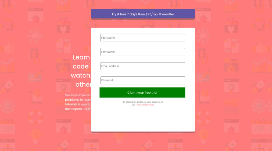
Design comparison
Community feedback
- @joaovitorwittPosted over 2 years ago
Hi, how are doing?
I am looking at your code and I see a lot of potential, but there is still room for improvement.
For this challenge I recommend you to take a look at "display: flex;". You can find amazing tutorials on Youtube, the ones I suggest are from "Traversy Media" and "Web Dev Simplified".
They both have excellent resources to learn front end.
For the HTML you can take a look at semantic tags like main, section, article...
https://developer.mozilla.org/en-US/docs/Glossary/Semantics#semantics_in_html
And lastly, to improve the responsiveness take a look at relative units, like rem, em or %
https://developer.mozilla.org/en-US/docs/Learn/CSS/Building_blocks/Values_and_units
Hope this helps you.
If you have any questions, feel free to reach out.
0@HelloDearSirPosted over 2 years agoI am good thank you and thank you for the improvements, with the display flex, I did use that for the display flex a few time :) and I was doing on 2590 screen size
0
Please log in to post a comment
Log in with GitHubJoin our Discord community
Join thousands of Frontend Mentor community members taking the challenges, sharing resources, helping each other, and chatting about all things front-end!
Join our Discord
