

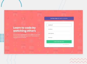
Design comparison

Community feedback
- @dev-mksinghPosted 9 months ago
Hey @SandyAstorga , well first of all, that's good work in your project. I would like to add something that i personally think will be better in future:
-
Right now you are using
pxfor width in different breakpoints(responsiveness) , prefer usingrelative-length unitslikerem,emand% -
Secondly, try using mobile first approach, currently you created the project firstly for the web version then you set the different breakpoints according to the screen sizes(that's what your code shows) , use
mobile-first approachyou will find it much better and you can do more by writing less code.
Hope this will be helpful to you. Happy coding.
Marked as helpful0@SandyAstorgaPosted 9 months ago@dev-mksingh Hello! Thank you very much for the observation, I have modified it, I would like to know your opinion again and know what else I can improve. Beforehand thank you very much!
0@dev-mksinghPosted 9 months ago@SandyAstorga yep now it look much more better and continuous. Yes that's good, well still its not mobile first approach, but lot better than previous one. Also i find something on your code:
body {
   min-height: 100vh;
}
Personally speaking, avoid using heights until its very much needed. The reason (that i understood by now) is if height is fixed you have boundaries there and have to set the elements height accordingly within many containers, which we dont want to do. Because we have tools like
flexgridto automatically have same height for all the elements within container.Hop my point is clear, and it will be useful again. Happy coding. Any help further will be my pleasure. And hey you are doing good, keep going better.
Marked as helpful0 -

Please log in to post a comment
Log in with GitHub
Join our Discord community
Join thousands of Frontend Mentor community members taking the challenges, sharing resources, helping each other, and chatting about all things front-end!
Join our Discord