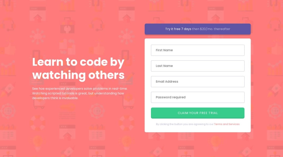
Design comparison
Community feedback
- @catherineisonlinePosted about 2 years ago
HI! Your solution looks nice though there are a couple of things you can improve which I hope will be helpful! 😊
I would also add some validation for Lastname, Firstname, and Password length because accepting just 1 letter I guess isn't the best choice.
Also, it gives me an error right away as soon as I start typing and never did form submit. I would change that logic probably.
Besides, when I submit the form it shows me an error only for the first input and nothing for the rest. There should be errors for all the empty inputs after submission.
I also see you don’t have README. README is a very important aspect of making projects, especially if you want other people to see it. As the name says, it’s the first thing people read when interacting with the project, it is kind of a manual. You can include many things there like the languages you used, which dependencies you installed, what was the process like, and what did you achieve or learn. Frontend Mentor also has a pretty nice README template which you can use to tailor the one depending on your preferences.
3
Please log in to post a comment
Log in with GitHubJoin our Discord community
Join thousands of Frontend Mentor community members taking the challenges, sharing resources, helping each other, and chatting about all things front-end!
Join our Discord
