Design comparison
SolutionDesign
Solution retrospective
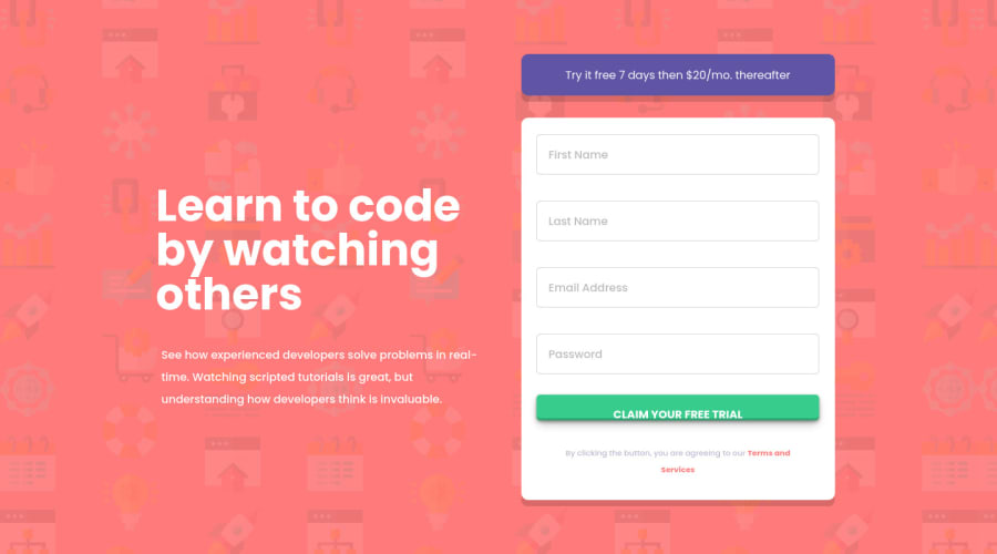
I am happy with the way the responsiveness displays. I redid the the responsiveness with less media queries. Only one breakpoint for the desktop. Before I had multiple media queries for tablet and other screen sizes but I simplified it with only one. I did have trouble with the JS and I'm surprised there is no CSS only way for making customizable validation errors. Any constructive feedback is greatly appreciated. Thanks
Community feedback
Please log in to post a comment
Log in with GitHubJoin our Discord community
Join thousands of Frontend Mentor community members taking the challenges, sharing resources, helping each other, and chatting about all things front-end!
Join our Discord
