Design comparison
SolutionDesign
Solution retrospective
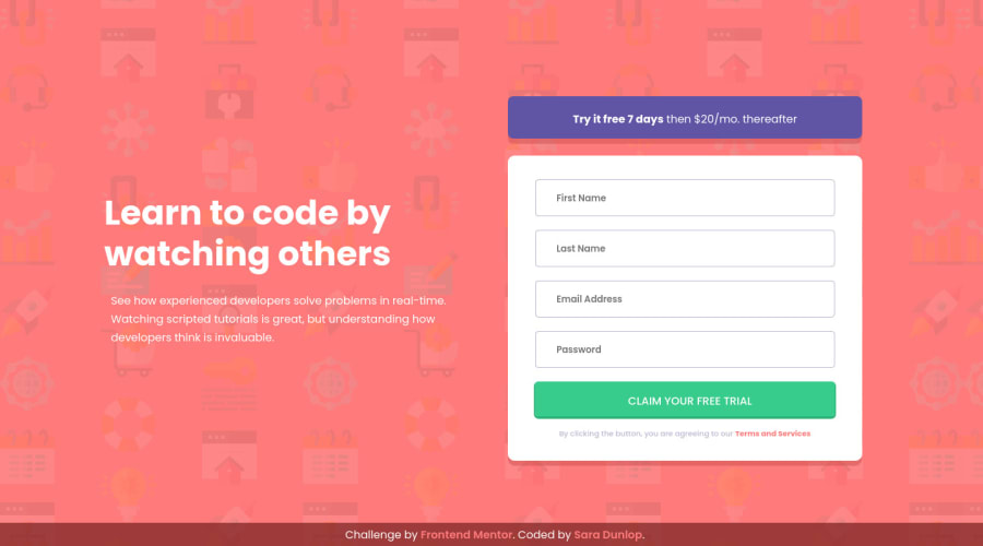
The one thing I had trouble with is the background. I got pretty close, but if you look closely, you'll see that it doesn't smoothly repeat, but instead has a column that visibly clips itself. You can partially see this column and then the background restarts. If anyone has any clues as to how I can fix this, I am all ears! Thanks 😊
Community feedback
Please log in to post a comment
Log in with GitHubJoin our Discord community
Join thousands of Frontend Mentor community members taking the challenges, sharing resources, helping each other, and chatting about all things front-end!
Join our Discord
