Design comparison
Solution retrospective
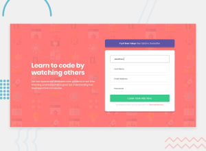
Hello Everyone, this is my fourth newbie project . Please let me know how I am doing. I have added responsiveness to every devices and validated the form using HTML 5.
Feedbacks are appreciated.
Community feedback
- @mattstuddertPosted over 4 years ago
Hey Sijan, nice work on this challenge. It's great to see you posting your 4th solution! Here are a few pointers after taking a look at your code:
- Your breakpoints for responsive could do with some reviewing. There are some screen sizes where the content looks very squashed, for example at
500px. - In your media queries, you're mixing
min-widthandmax-width, which can be quite confusing in the early days of coding. I'd recommend sticking to one or the other. My preference ismin-widthas it can often lead to less CSS code and has the benefit of loading in fewer styles for mobile users, which can be a nice performance gain. - You could go through the CSS one more time matching your solution up to the design to try and get your project as close to the design as possible. Accuracy is a key part of being a front-end developer, so it's a skill that's well worth taking some time to build. Your overall layout is great, but there are some sizings and spacings that are a little off when compared to the design.
- Take a look at the solution report and try to resolve the accessibility issues.
I hope this helps. Let me know if you have any questions. Keep up the great work!
0@sijandahalPosted over 4 years ago@mattstuddert Thank you sir for your feedback, I will definitely go through the code and try to be more precise. And I will again have a look on media queries to reduce my confusion.
0@sijandahalPosted over 4 years ago@mattstuddert Can you please give me some hits on responsiveness ? ow to easily achieve them in all of the sizes and width ?I always seem to be confused in this part of the processs.
0@mattstuddertPosted over 4 years ago@sijandahal it changes from project to project, so it's hard to give good advice on building responsive websites. I would just play around with your browser width and find areas where the content is looking either too squashed or too stretched and then resolve it. You can also use the in-built device emulator in Chrome or Firefox to see how the site looks on common device widths.
I hope this helps! A lot of it comes down to practice. You'll get faster and better at it with each project you complete.
0 - Your breakpoints for responsive could do with some reviewing. There are some screen sizes where the content looks very squashed, for example at
Please log in to post a comment
Log in with GitHubJoin our Discord community
Join thousands of Frontend Mentor community members taking the challenges, sharing resources, helping each other, and chatting about all things front-end!
Join our Discord
