Submitted about 1 year agoA solution to the Intro component with sign-up form challenge
Intro component with sign up form solution

@gilotin
Solution retrospective
What are you most proud of, and what would you do differently next time?
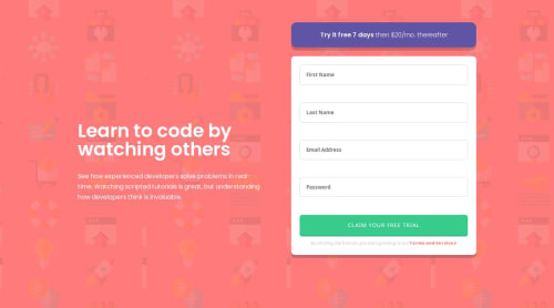
I'm happpy with the end result and how i styled error icons. Logic behin the veritification was really good for people who didn'n code any JS in awhile.
What challenges did you encounter, and how did you overcome them?- From the previous challenge i was able to put error icons on the right position with absolute, but with multiple icons on a different inputs I found it's much more quicker and looks better with using background on the input itself.
- Making email placeholder to switch the text and the color wasn't easy to, but with help from Chat GPT I managed to do it.
- Refactoring the logic (in javaScript.js) behind the verification was a hard task too.
- I'll be happy to recive critique for my HTML and CSS.
- Open to any critique.
Code
Loading...
Please log in to post a comment
Log in with GitHubCommunity feedback
No feedback yet. Be the first to give feedback on Nikolay Toshev's solution.
Join our Discord community
Join thousands of Frontend Mentor community members taking the challenges, sharing resources, helping each other, and chatting about all things front-end!
Join our Discord