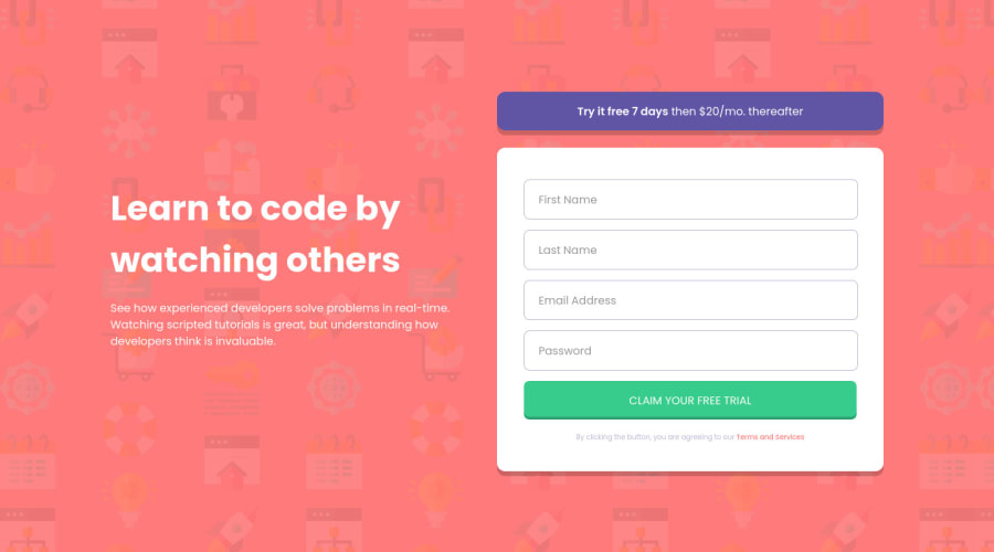
Intro component with sign up form solution
Design comparison
Solution retrospective
This was the first time using a CSS Preprocessor (SCSS). Any feedback or suggestion about my code is welcome! š
Community feedback
- @dwhensonPosted almost 3 years ago
hey @ojitxslml lovely job here! š„³ - the page looks great and is nice and responsive.
Here's a few points you might like to consider:
- I would make your
p
with afirstBox_title
into a header, probably ah1
in this case as there's no other headers on the page - this will just add a bit more structure. - You can probably put your link text directly inside an
a
element without the need to add ap
as a child. (As you have at the moment under thesecondBox_banner
link). - Rather than using js to add the selected class, you could try using the
focus
psudo class on the input elements. This should achieve the same thing, and make your life easier. - For the list of inputs, I saw you had to do some tricky calcualations to get the width working. I would suggest, setting the form as
display: flex
with direction as column, and using gap and padding on the parent to control the widths of the inputs for example:
form.register__form { display: flex; flex-direction: column; gap: 2em; padding: 2em; }
Then removing the set width and margins from the inputs themselves. This just seems more robust to me.
-
For the errors I would switch between
visibility:hidden
andvisibility:revert
. The advantage being that this retains space in the DOM for the hidden element and reduces jank. You may need to adjust the spacing between inputs to account for this. -
For the JavaScript, I would consider having a look into event delegation rather than looping through the inputs on each submission, but this is just a personal preference! Perhaps consider it next time you find yourself in a similar situation?
Well done and keep up the good work!! š
Hope this helps - let me know if anything is not clear.
Cheers š
Dave
Marked as helpful1@ojitxslmlPosted almost 3 years ago@dwhenson Hello!! thanks you so much for taking your time reviewing my code, Everything is clear, I would keep on mind your suggestions and I'll do some research to use all of these on new challenges and projects, I'm very grateful š
0 - I would make your
Please log in to post a comment
Log in with GitHubJoin our Discord community
Join thousands of Frontend Mentor community members taking the challenges, sharing resources, helping each other, and chatting about all things front-end!
Join our Discord