
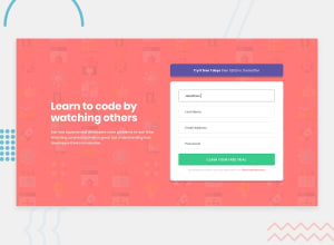
Intro Component With Sign Up Form | Responsive | HTML CSS JS

Design comparison

Solution retrospective
What should I fix/improve?
Community feedback
- @correlucasPosted about 2 years ago
👾Hello Jarrian, Congratulations on completing this challenge!
Here’s some tips to improve your solution code:
1.I saw that for some properties you’ve used
remand for otherspx. In this case it is better to use only one kind of unit to have a better organization for your code.relative unitsasremoremthat have a better fit if you want your site more accessible between different screen sizes and devices.REMandEMdoes not just apply to font size, but to all sizes as well.2.To reduce your css file and improve the performance loading your page you can use a tool called
css minifythat reduces the css code removing the unnecessary characters. You can use aVSCodeplugin calledminify cssor this website tool to reduce your code:https://www.toptal.com/developers/cssminifier3.To save your time you can code you whole page using
pxand then in the end use a VsCode plugin called px to rem heres the link → https://marketplace.visualstudio.com/items?itemName=sainoba.px-to-rem to do the automatic conversion or use this website https://pixelsconverter.com/px-to-rem✌️ I hope this helps you and happy coding!
Marked as helpful1@godkingjayPosted about 2 years ago@correlucas thanks for the tips, I will definitely use these tools you mentioned.
0 - @hyrongennikePosted about 2 years ago
Hi @godkingjay,
Nice job on completing the challenge
To center the content you can replace your rule with the following.
.wrapper {
    display: flex;
    width: 100%;
    flex-direction: column;
    position: relative;
    align-items: center;
    justify-content: center;
    max-width: 1440px;
    margin-inline: auto;
    padding-inline: 2rem;
    padding-block: 0;
    min-height: 100vh;
}
it's just setting a
min-heightinstead ofheightand remove the padding.Marked as helpful1


Please log in to post a comment
Log in with GitHub
Join our Discord community
Join thousands of Frontend Mentor community members taking the challenges, sharing resources, helping each other, and chatting about all things front-end!
Join our Discord