

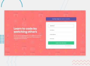
Design comparison
SolutionDesign

Solution retrospective
feedback welcome
Community feedback
- Account deleted
Hi Mohd,
Fantastic work! There is very little I could find that needs a little bit of change:
- The error icons that show when a field is empty/incorrect are missing their alt text.
- On mobile, when fields are empty/incorrect, there is very little spacing between the fields and the error message under them - I think adding a little bit of padding on top and under the error messages would improve readability.
Other than that, fantastic work!!
Marked as helpful0 - @ProgressOnyemaPosted almost 2 years ago
Amazing, your placement of elements on the page was very precise and clean.
Awesome!😼
0

Please log in to post a comment
Log in with GitHubJoin our Discord community
Join thousands of Frontend Mentor community members taking the challenges, sharing resources, helping each other, and chatting about all things front-end!
Join our Discord