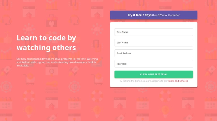

Design comparison
SolutionDesign

Community feedback
- @bccpadgePosted 3 months ago
Hi @RahmaBahaa. Congratulations on completing this challenge!!!🎉
Your project looks good so far! I have a few suggestions to improve your solution.**
HTML 📃:
- Every website must have at least one landmark like a
<main>tag
Example:
<body>
<div class="container"><div>
<main class="container"></main>
</body>
The difference between the
<div>and<main>tag is the<div>is non-semantic element that doesn't explain the content.More info📚:
CSS 🎨:
Flexbox
- You can remove the
paddingbecause it is not needed.
.container{
 display: flex;
 align-items: center;
 /*padding: 20px 100px; */
 justify-content: center;
 min-height: 100vh;
}
CSS Grid
.container{ display:grid; place-content: center; min-height: 100vh; }- You can also add
max-widthinstead of thewidthto.leftSectionand.rightSectionso the content will not stretch the page. - Providing a
widthgives elements a fixed width that doesn't change
More info📚:
Here is my solution to this challenge: Responsive Sign up form using HTML, CSS & JS
- The reason why the
background-coloris blue because the title and paragraph meets WCAG AAA accessible text for Color and Contrast fix.
I hope you find these tips useful! Don’t hesitate to reach out if you have any questions or need further guidance. Keep up the amazing work!
Marked as helpful0 - Every website must have at least one landmark like a

Please log in to post a comment
Log in with GitHubJoin our Discord community
Join thousands of Frontend Mentor community members taking the challenges, sharing resources, helping each other, and chatting about all things front-end!
Join our Discord