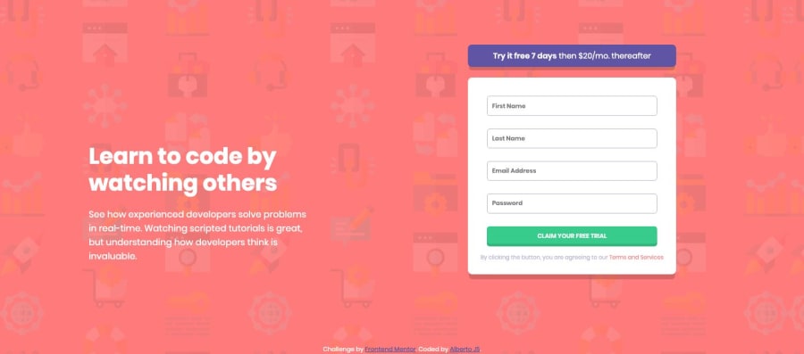
Design comparison
SolutionDesign
Solution retrospective
Any better ways to do the form validation and the error-icon positioning are appreciated as well as any observation.
Thanks :)
Community feedback
- @mattstuddertPosted about 5 years ago
Nice work Alberto! How did you get on with this challenge? Learn anything new while building it?
- For the positioning of the error icon, you could wrap the
inputandsvgwith adiv. This would mean the element would grow in height when an error message shows. - For the validations, I'd recommend having a look through other solutions from the community for the same challenge. You'll learn a lot by reading other people's could and seeing how they implemented the validation. There are so many possible ways you could go about it.
Let me know if you have any questions. Keep up the great work! 👍
0 - For the positioning of the error icon, you could wrap the
Please log in to post a comment
Log in with GitHubJoin our Discord community
Join thousands of Frontend Mentor community members taking the challenges, sharing resources, helping each other, and chatting about all things front-end!
Join our Discord
