
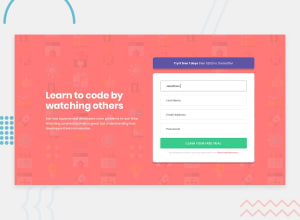
Intro Component w/ Sign up using SCSS & JS validation & a simple toast

Design comparison

Solution retrospective
Feedback is always welcome! Tried to have some fun with this one by adding a really simple toast on a successful form submission. Its really not fancy but it was fun to do.
Community feedback
- @melwyntPosted over 2 years ago
Hi Andy 👋 Your solution is really good. I like the animation on the text placeholders. Some people might argue that it's too distractive but for the purpose of the challenge, it's a nice touch.
And the toast is definitely a good UX decision. This way you avoid the user into thinking that the form is not submitting anything.
My only comment would be on the readme file. Even if we are not the ones that created the designs, it might be good to add in the Readme file those UI/UX decisions and introspections 😃. Especially if those are decisions you took on your own and were not provided in the requirements.
Cheers and have a great weekend.
Marked as helpful0@AndyAshleyPosted over 2 years ago@melwynt Thanks for the feedback! I definitely have to get better at documenting things in readme files. I often add/switch up elements that are interactive on these challenges for fun.
1

Please log in to post a comment
Log in with GitHubJoin our Discord community
Join thousands of Frontend Mentor community members taking the challenges, sharing resources, helping each other, and chatting about all things front-end!
Join our Discord