Design comparison
SolutionDesign
Solution retrospective
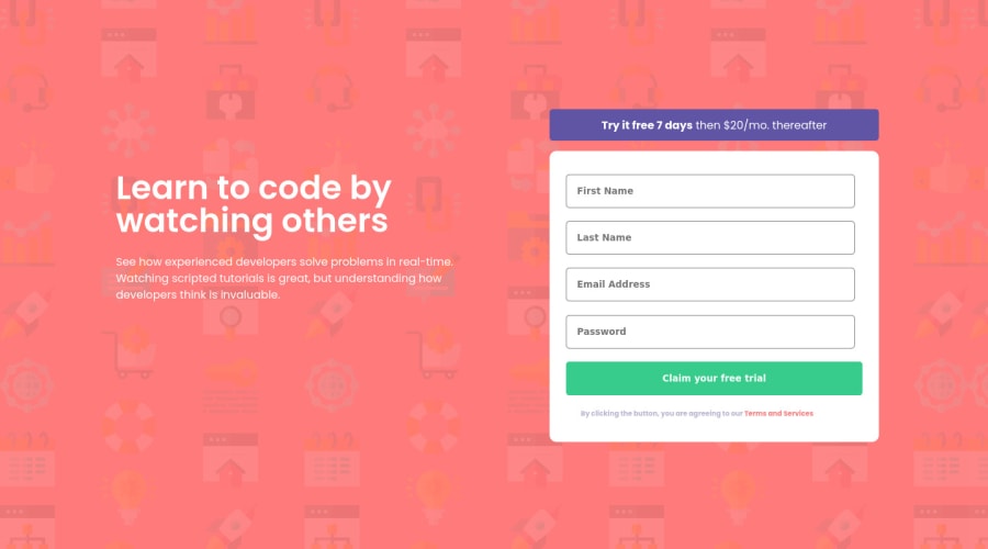
I still have to add the error icons into the input boxes. I still cannot figure it out yet.
Community feedback
- @shashreesamuelPosted over 2 years ago
Hey good job completing this challenge
Keep up the good work
Your solution looks great however I think that the content to the left of the card needs some margin from the left using
margin-left.I hope this helps
Cheers Happy coding 👍
Marked as helpful0
Please log in to post a comment
Log in with GitHubJoin our Discord community
Join thousands of Frontend Mentor community members taking the challenges, sharing resources, helping each other, and chatting about all things front-end!
Join our Discord
