Intro Comp. with Signup Form built with SCSS, BEM, & Vanilla JS
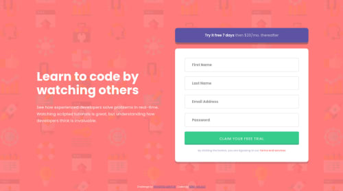
Design comparison
Solution retrospective
I'm really proud of this project for a couple of reasons. First, I've always avoided working with HTML forms, but in the challenge I had to "face my fears". I think I did pretty good considering that this was the first time, using Vanilla JS 🟨 to validate any type of form. Second, this was the first time when I used Vanilla JS 🟨 without any outside source, tutorial, or anything like that. Besides RegExp
of course (for the record, I know RegExp
, but not that good to write an email or password validator), but I mean common it's still pretty cool, eh? 👨🏻💻 Anyhow, cool project, simple design, a bunch of cool stuff to learn and practice.
What comes to continued development 🤓 I'd like to sharpen my skills of animations and how to manipulate them with Vanilla JS 🟨 I'm planning on implementing some basic animations for this project because it looks pretty raw without them 🤔
P. S. I have added some extra challenges for myself, there's also a password validation, and different error messages when you leave it blank or insert a wrong password. Also, there's a success message at the end, when everything is submitted successfully.
If you have feedback 👨🏻💻 feel free to leave it in the comments section. Cheers 👾
Community feedback
- @pikapikamartPosted about 3 years ago
Hey, awesome work on this one. Layout in desktop looks great, it is responsive and the mobile state looks great as well. Though I suggest lowering down the breakpoint since right now, at 114px it already shows the mobile/table layout which is too big for those and desktop layout could use more those screen-time.
It is great having to see lots of others giving feedbacks, just going to add some suggestions as well:
- Right now, the error works but is only limited for sighted users right now. To make the form more accessible:
- the error-message for each
input
should have anid
attribute. - When
input
is wrong add anaria-invalid="true"
to inform a user when they navigate on theinput
that it is invalid. - When
input
is wrong add anaria-describedBy
attribute on it, the value of this attribute will be theid
of each error-message. This way, they will know what kind of error they had made based on the text-content of each error-messages. - Making it more accessible, have an
aria-live
element. This element will announce if the form submitted has successfully submitted or if it has any errors. This way, user will be informed right away about errors.
- the error-message for each
A pseudocode of steps 1-3 looks like:
if ( input is wrong ) input.setAttribute("aria-invalid", "true"); input.setAttribute("aria-describedBy", id of the error-message); else input.removeAttribute("aria-invalid"); input.removeAttribute("aria-describedBy");
To implement the
aria-live
have a look at this simple accessible form that I created. This implemented the other attributes I mentioned as well, see the structuring and the manipulation of the attributes.If you have any queries, just drop it here okay. Aside from those, great work again on this one.
Marked as helpful0@kens-visualsPosted about 3 years ago@pikamart thank you for making the form accessible. Although it's not a real-world project, it's still useful to get into the habit of building more accessible stuff.
1 - Right now, the error works but is only limited for sighted users right now. To make the form more accessible:
- @MarlonPassos-gitPosted about 3 years ago
Congratulations on your completed 10 Challenge 🎉🎉🎉
I really liked your solution, flexible, functional and similar to the original version.
However I have some suggestions for you to improve even more.
- "Terms and Services" should be an <a> tag as this usually takes the user to another page
-As a good practice and to avoid future bugs, I recommend putting the script tag just before the closing </body> tag rather than in the <head> section of your HTML, any doubt I recommend reading https://levelup.gitconnected.com/all-about-script-87fea475b976
- Another nice thing to do is enable the hover effect when using TAB, just add
, :focus-visible
to your hover CSS. Example
.intro__button:hover, .intro__button:focus-visible { cursor: pointer; opacity: 0.65; }
-
When I get out of 750px width the designe shrinks at once, I think if you set a maximum width in the form and only changed the button it would leave a lot more space for the user to interact.
-
About the title, there is a really cool technique where you could make the font size of the title flexible media query using clamp(), I recommend you read this article https://css-tricks.com/linearly-scale-font-size-with-css-clamp-based-on-the-viewport/#for-those-who-dont-mind-that-edge-case
Marked as helpful0@kens-visualsPosted about 3 years agoHey @MarlonPassos-git 👋🏻
Thanks and congrats to you too for the 10th project 🍾
- I was thinking about putting "Terms and Services" in
<a>
tag, but I was thinking since it doesn't have any modals, a new page, shortly in this case it's just there to complete the design I decided not to. Generally when you do that, it also should have a:hover
state and if you add a:hover
state a user expects it to function. And since the overall project includes JS, I think it would've been confusing if some part of the code had a functionality, but the rest didn't. But that's just my opinion 🙃 I'm glad that you mentioned it, I may change my mind and add some:hover
states to it 🤔 - I've also read that article, I like browsing Medium, like a lot 😂 But I think you missed a pretty important part, which is at the bottom. When you add
defer
to yourJS
, as I did, no matter where yourscript
tag is it will first parseHTML
then executeJS
.async
is cool too, but I've researched on this topic and a lot of senior developers suggest usingdefer
, however, it depends on the project as well. - Good point about tab and
:hover
I'll implement it later on. - Coincidentally, I was watching Kevin Powell's responsive typography yesterday. So, yeah, for the future project I'll try to get my hands on
clamp()
Thanks for the suggestions 👨🏻💻 Cheers 👾
1 - @GabrielAlberiniPosted about 3 years ago
Waw! Good interactivity. Can you explain to me how you went about resetting the form and its styles once submitted? I can not do it :(
Minutes ago, I uploaded the same project (if you want, you can look at my code) :)
Thanks! I follow you :D
0@kens-visualsPosted about 3 years agoHey @GabrielAlberini 👋🏻
I was just looking at your project, and I've noticed a couple of odd things.
- Let's say I have some valid info inputted like a name and last name, and I accidentally input invalid email and password, when I click the button it clears the other valid inputs too. So before cleaning anything you have to get all the input and check if each and every one of them has a valid input in it. If yes, print a success message and with
setInterval()
clean all the input after a second or two. If not then don't do anything until user fixes the invalid inputs.
I hope this was helpful 👨🏻💻 overall structure of your JS looks good, you need to work on
clearnForm()
, that's the function that causes bugs, again because there are no conditions in it, and it just clears the form every time I click on the button no matter if there's a valid or invalid input. Cheers 👾Thanks for following me, I really appreciate the support, and I'm glad that I can be helpful 😇
1@GabrielAlberiniPosted about 3 years ago@kens-visuals Are goods advices, I will be working on it. Thanks you once again :)
0@kens-visualsPosted about 3 years ago@GabrielAlberini no problem, let me know if anything ✌🏻
0 - Let's say I have some valid info inputted like a name and last name, and I accidentally input invalid email and password, when I click the button it clears the other valid inputs too. So before cleaning anything you have to get all the input and check if each and every one of them has a valid input in it. If yes, print a success message and with
- @MojtabaMosaviPosted about 3 years ago
1- The expected interactivity of the cta is missing.
2- There's no point for setting the alt attribute without any value and it can cause unexpected behavior such as screen reader reading out the value for src attribute instead of the alt. The alt should be set to an empty string but in this case you've the aria-hidden which removes it from the accessibility tree so there is no need for it.
Keep coding :=)
0@kens-visualsPosted about 3 years ago@MojtabaMosavi good point about
alt
s. But could you please explain the first point?0@MojtabaMosaviPosted about 3 years ago@kens-visuals Of course, On top of you form you have a button like widget that is users expect to be able to inteact with it, like a link or button.
0@kens-visualsPosted about 3 years agoI'm @MojtabaMosavi, but I think you're mistaken. Usually that type of things are included in
active-state
image in Frontend Mentor's folder. If there's some sort of interaction, inactive-state
image, button, link, or whatever it is, they clearly show how it should look like when a user interacts with them. However, if you added some interaction in your project, good for you. At the end of the day, this is just for practice and to have some fun while learning new skills 🙃0@MojtabaMosaviPosted about 3 years ago@kens-visuals Sometimes it's better to trust your intuition/conventions about how a feature should behavie rather than some blueprint (how would you want to consume it?) and I think trying getting creative with different features in a project is quite fun.
0@kens-visualsPosted about 3 years ago@MojtabaMosavi agreed, but that's in a case when you're building the design from scratch, whether it's for you or for a client. However, let's not forget that we're all here because of those blueprints, and the main challenge that's stated under every project is that get it looking as close to the design as possible. So that's why I tend to follow the rules of Frontend Mentor, and even if I add something from myself to spice things up, it's just me and my project, I wouldn't ask other users to try to implement what I did.
0@MojtabaMosaviPosted about 3 years ago@kens-visuals You know what's best for you but I think you're looking at it from different perspective than I intended, here on frontend mentor we are a lot of devs with different way of seeing things and being a part of it entails being open to appreciate that diffence and use it contructively.
0
Please log in to post a comment
Log in with GitHubJoin our Discord community
Join thousands of Frontend Mentor community members taking the challenges, sharing resources, helping each other, and chatting about all things front-end!
Join our Discord