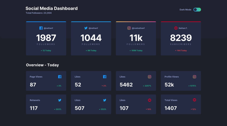
Intrinsic Grid Design using React, NextJS and VanillaExtract
Design comparison
Solution retrospective
This was my first time using a screen reader to test from the beginning. That guided my mark-up decisions that I think were mostly successful. But it can be difficult coming up with suitable mark-up for an app-style solution, rather than documents that often have a more obvious structure. I'd be keen to hear if anyone would have approached the mark-up differently.
I've adjusted some of the colours and font-sizes from the original design as they didn't meet accessibility standards around contrast. I've tried to preserve the intent of the design though.
I've put a lot of work into making sure that the theming respects user choices, and saves them for later, with no flashing of un-themed content.
I've attempted to make it responsible across screen sizes while avoiding media queries. There was one that I couldn't figure out how to avoid (the re-flow of the heading from row to column). If anyone can think of a way to do that without the media query, I'd love to hear it.
Community feedback
Please log in to post a comment
Log in with GitHubJoin our Discord community
Join thousands of Frontend Mentor community members taking the challenges, sharing resources, helping each other, and chatting about all things front-end!
Join our Discord
