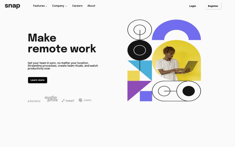
Design comparison
Solution retrospective
I didn't use js because I don't know how to use it, I'll come back to this project in the future to modify it, however in the mean time can someone please tell me how to make a hoverable drop down menu it would mean a lot. I feel like there was a problem with my html which also didn't allow the dropdown menu to work, so can someone give me feedback on that as well. Thanks :)
Community feedback
- @elaineleungPosted over 2 years ago
Hi Alieu, great job working on this, as this challenge is not an easy Junior one!
About the dropdown, all you need to do is to write a
:hoverrule on the title link that affects the dropdown nav. Since the title and dropdown nav are siblings (siblings meaning they're at the same level, not a parent/child) and they happen to be just next to one another, we can use the adjacent sibling combinator,+..link-1:hover + .dropdown-list-1 { display: block; }This just means, we're telling the browser that when there is hovering on the link, change the dropdown nav to a block element. The last item in a selector is always the one that is affected by the rule. I got that working in the browser inspector for me, so hopefully that works for you as well. One other thing you'd want to look into is, at a smaller screen size (but not mobile view), the nav items are very tightly put togehter; I suggest giving it some margin to keep them apart. Good luck with the JS in the future!
Marked as helpful1 - @alieuk61Posted over 2 years ago
also can someone please let me know if the actual website looks different/the same to solution displayed in the design comparison, because to me the solution that i see looks worse than what i see when i click on the website.
0@elaineleungPosted over 2 years ago@alieuk61 Ah, I just read this... yes, the screenshot matches what I'm seeing in my browser. I notice in your stylesheet that there aren't any reset/normalize rules. I think you can consider adding them (I use reset rules in every project), as that would help to ensure that your styles can be consistent across browsers since each browser has its own default styles. At the very least, you should try to have the star selector
box-sizing: border-boxandmargin:0rule.I also have a few other suggestions as I'm looking at your code right now more closely:
-
The hero image is a bit distorted, so I'd suggest adding an
object-fit: containto fix that. -
You got a number of containers as flexbox here, and I think you can use that to your advantage by using
flexin the children containers instead of a fixed percentage width. For example, in the header, it doesn't stretch all the way to the right end on larger screen size. To make it stretch, I would remove thewidthyou have on thefinal-buttonsand addflex: 1instead. -
Right now the image seems to be overflowing to the side when I'm resizing the browser, and I think that has to do with the large margin on the image as well as the fixed width on the
h1title. I'd probably use a max-width on the title, or, as I mentioned in the point above, I might try usingflexfor that text container.
Good luck working on this!
Marked as helpful1 -
Please log in to post a comment
Log in with GitHubJoin our Discord community
Join thousands of Frontend Mentor community members taking the challenges, sharing resources, helping each other, and chatting about all things front-end!
Join our Discord
