Submitted over 1 year ago
Into its own page on React app with Scss
#react#react-router#sass/scss#vite
@bcrave
Design comparison
SolutionDesign
Solution retrospective
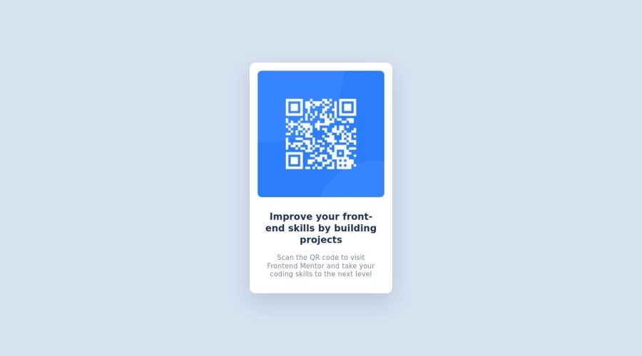
How do you prefer to build elements? For this card, I started with the layout of the element itself, defining the height and width of the card, and then placing the image and text inside, wrapping them in a content div with a width relative to the card's width. If I were to start over, I might start with adding the image first and text first, wrapped it in a content div, defined the width of that div directly, and then define the height of the card with margin and padding.
Community feedback
Please log in to post a comment
Log in with GitHubJoin our Discord community
Join thousands of Frontend Mentor community members taking the challenges, sharing resources, helping each other, and chatting about all things front-end!
Join our Discord
