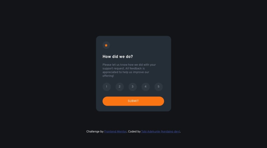
interview-rating-components using html css and vanilla js
Design comparison
Solution retrospective
suggestions and opinion is highly welcome
Community feedback
- @K01wfdPosted about 1 year ago
Hi Hezekiah, some tips for your solution:
1- for this project you dont need a media query for resetting the size of the main container or placing it, just throw min-height on body 100vh, display grid, place content center, that's it.
2- avoid as much as you can using expecit width or height, always stick with default value which is auto, and if so try to not use pexels for sizing, consider relative units.
3- a good reset for the css in every proect will make your life much easier, at the top of your css file use the global selector to select everything and throw this reset: box-sizing border-box, margin 0, padding 0, font inherit.
4- in your js file when trying to query multiple elements, try to query the elements with the same class, or throw data attribute on your HTML element so it will make it would be much more obvious,.
Marked as helpful0@kerdainoPosted about 1 year agothank you for the tips and the suggestion will be sure to follow through @Korg01wfd
0
Please log in to post a comment
Log in with GitHubJoin our Discord community
Join thousands of Frontend Mentor community members taking the challenges, sharing resources, helping each other, and chatting about all things front-end!
Join our Discord
