Design comparison
Solution retrospective
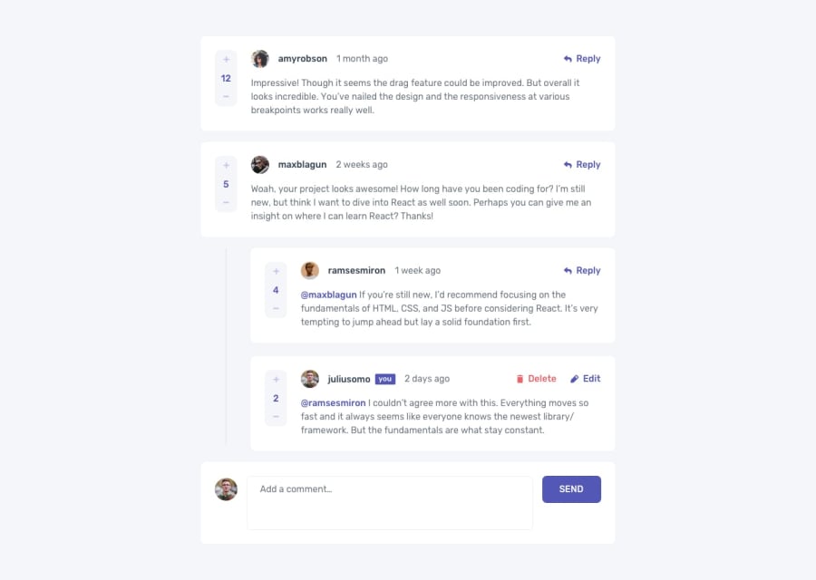
The challenging part in this challenge was adding the CRUD functionality. You need in depth understanding of useState hook to be able to do so. Also , the design is a bit different for Desktop and Mobile screen, so you make adjustments to your design accordingly.In this project i successfully implemented the Mobile First workflow method, resulting in a seamlessly responsive design.Overall, I consider it a successful project that significantly contributed to my growth and improvement.
Community feedback
- @dejuliansrPosted 9 days ago
You have done your work well, a little suggestion from me to improve the function of the plus and minus buttons, and also the layout for replying to comments can still be improved again so that it is neat
0
Please log in to post a comment
Log in with GitHubJoin our Discord community
Join thousands of Frontend Mentor community members taking the challenges, sharing resources, helping each other, and chatting about all things front-end!
Join our Discord
