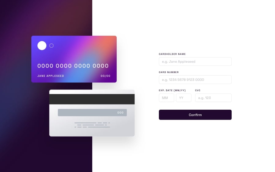
Design comparison
Solution retrospective
Give me your feedback
Community feedback
- @Aik-202Posted about 2 years ago
Hi Sergio, Wow! You did amazing! What I loved most was the way the card details changed as the input of the user changes, nice idea. I just completed this challenge my self not quite long ago, I didn't think of that... I have some suggestions tho, the responsiveness is not quite there, I too battled with responsiveness. So here are my suggestions:
1.) For the desktop site view on mobile... Try reducing the width of the cards... And try using height: 100vh so that the background image will take the height of the entire viewport and you can also adjust the width of the image to give more room for the form.
2.) For Mobile responsiveness, try adding a media query for screen size max width 480px to your css and style accordingly.
Nice work so far!
0
Please log in to post a comment
Log in with GitHubJoin our Discord community
Join thousands of Frontend Mentor community members taking the challenges, sharing resources, helping each other, and chatting about all things front-end!
Join our Discord
