Design comparison
SolutionDesign
Solution retrospective
Recently started learning JS. Used this project to practice what i have learnt from DOM manipulations.
Any feedback on how i can improve and learn more about JavaScript would be great.
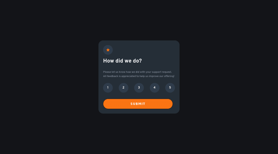
Also noticed that my active state for my button did not show up ? I made it white but the transition was quick. What are my options?
Community feedback
- @besttlookkPosted over 2 years ago
HI, Following are some points i like to make:
- Paragraph font is bit small for big screen.
- Use "cursor:pointer" on all buttons.
- I see you used "li" element to wrap number. Try using "button" element. inside "li".
- The reason why you active state is quick because you have not added "transition"
li{ transition: all .5s }- After the number is selected design the selected number differnetly to let user know what number he/she has selected.
Good luck #happyCoding
0
Please log in to post a comment
Log in with GitHubJoin our Discord community
Join thousands of Frontend Mentor community members taking the challenges, sharing resources, helping each other, and chatting about all things front-end!
Join our Discord
