interactive-rating-component-main with oop and localStorage propertie
Design comparison
Solution retrospective
I don't have a particular question concerning this project.
But I'm still open for every suggestions that can make me improve the user experience of this Web application. Every suggestions that can make me improve my coding skills is also welcome
Kind regards
Christ-Kevin
Community feedback
- @grace-snowPosted over 2 years ago
Hi
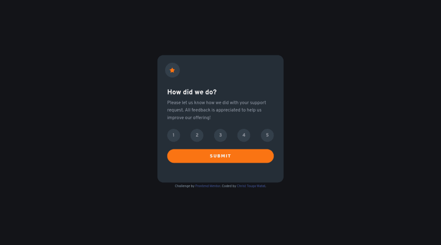
I’m afraid the html on this needs updating a bit
- The star icon is decorative, therefore it’s alt text should be blank
- As the only contents in there is an image, that should not be a header element either. A header is a landmark element so should only be used outside of main and contain repeating content across a site (eg logo, nav)
- A nav is for navigation only. It is definitely not meant to hold a set of form inputs. Same with the ul and lis, they shouldn’t be used here. Those numbers should ideally be contained by a fieldset. I would recommend using aria-labelledby on that fieldset pointing to the id of the question, so it acts as a legend. And aria-describedby pointing to the id of the helper text.
- This should be a set of radio inputs, not a load of buttons. The expected UI for this has to be radios because you can only choose one from a set. At the moment, keyboard users would have unexpected controls, requiring them to tab when they should be able to use arrow keys; and screenreader users would have no indication as to what has been selected.
- Similar to above, the results section image is decorative so should not have filled alt text. Therefore it should not be in a figure element either.
- That means you shouldn’t be using figcaption. Just a title and the paragraphs in the thank you panel
- The thank you panel should not be an article. It is not a piece of content that could be syndicated on other sites, it is just a form submit status
Overall the js on this is more complicated than it needs to be and most of that is just from using the wrong html elements. Default behaviour of a form with a set of radios inside would give you the chosen value to use and that one value is all you need js for (you chose X). As a general rule try to use js for as little as possible when native browser behaviour can do the heavy lifting
Marked as helpful1@grace-snowPosted over 2 years agoOne more tiny thing. I think because of the width you’ve added to those li elements, this doesn’t quite fit on my iPhone 12 mini screen. I shouldn’t be seeing horizontal overflow there.
0 - @hyrongennikePosted over 2 years ago
Hi @Christ-Kevin,
Congrats on finishing the challenge, just a few snags you can look at. The user is still able to submit even though no value was select which you can disable the submit button if no value was selected or you se the default value to 1 rather it being zero. You should only allow one rating number to have the selected state at the moment I'm able to select more than one rating number and the last would be to just look at the report and fix those errors by doing so your next challenge won't have them because you would know how to prevent them from occurring.
Marked as helpful1
Please log in to post a comment
Log in with GitHubJoin our Discord community
Join thousands of Frontend Mentor community members taking the challenges, sharing resources, helping each other, and chatting about all things front-end!
Join our Discord
