Design comparison
Solution retrospective
Help me preview my site.Thank you for your kindness.
Community feedback
- @danielmrz-devPosted 12 months ago
Hey @Kaung-Thant-Soe!
Your project looks nice!
I have one suggestion:
-
Try adding
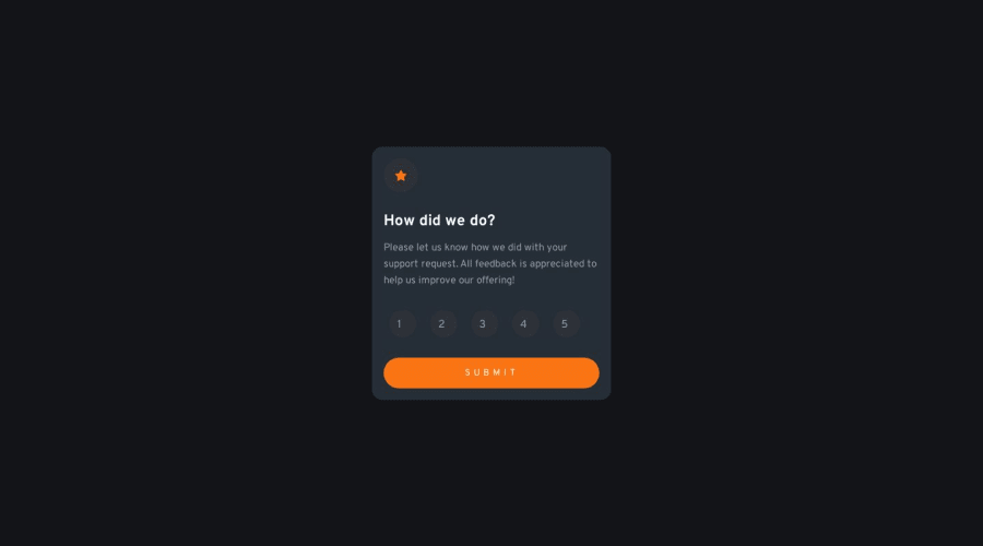
justify-content: center;on your.subNumberdiv. This will probably place the numbers in the middle of the circles. They are a little bit to the left now. Give it a try! -
Also, you can add a little
paddingon yourcontainer. The content is too close to the borders.
I hope it helps!
Other than that, great job!
Marked as helpful1@Kaung-Thant-SoePosted 12 months ago@danielmrz-dev I didn't notice that.I am too absorb on using text-align and forgot that.Thanks for the advice .
0 -
- @Sapayev1005Posted 12 months ago
live server
1@Kaung-Thant-SoePosted 12 months ago@Sapayev1005 I don't really get what you mean
0
Please log in to post a comment
Log in with GitHubJoin our Discord community
Join thousands of Frontend Mentor community members taking the challenges, sharing resources, helping each other, and chatting about all things front-end!
Join our Discord
