Submitted over 2 years ago
interactive-rating-component with simple html and js
@bilwagutthi
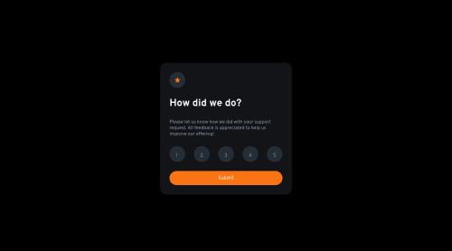
Design comparison
SolutionDesign
Solution retrospective
No particular question but any recommendations to improve is welcome :D
Community feedback
- @Sayfo1809Posted over 2 years ago
I realised, while going through your js code that you left your tests in there.
0 - @GrzywNPosted over 2 years ago
Awesome job on the challenge!
I have some minor suggestions regarding your solution:
- You should remain consistent throughout whatever you're writing. For example you set your CSS custom property's name to
orange
and other ones start with uppercase and use PascalCase. I would recommend using kebab-case, but of course it's up to you what you prefer. Also it's good to remain consistent in using class names. For example you can name every element with a class and use classes instead of combining classes with children selectors. These are really small, but it's great when code is readable, consistent and maintainable, even if newer editors like VS Code have autocompletion. - Also it's a good practice not to use universal selectors -
*
. I think the only moment when you can use this selector is at the beginning, when you reset/normalize things e.g. margins, paddings and settingbox-sizing: border-box
. Also sometimes when some script is working on every element on the page (e.g. animation stopper). - You used
vertical-align
property which doesn't work in this case, since it only works for tables and inline elements. To center a div, you can use properties:display: grid
andplace-content: center
/place-items: center
. You can of course use flexbox, but grid is also the way I like and I wanted to recommend. - Colors doesn't match the design, but it's because of the creators, since they didn't include right colors in the style-guide for this project. You can simply pick colors with any color picker and use them throughout your project.
- If you want to make your solutions better looking, you can compare the designs by using diffchecker. It's great to improve solutions to match the design before submiting. I use it a lot.
Hope this helps! Have a nice day and happy coding! :)
0 - You should remain consistent throughout whatever you're writing. For example you set your CSS custom property's name to
- @ccreusatPosted over 2 years ago
Hi ! Nice challenge done !
You should fix to things :
- line-height of your
<label>
numbers (seems to not be centered)
check your code because you are putting
align-items: center
on the labels but not usingflex or inline-flex
(I sawdisplay:inline-block
)- Text of the Thanks screen should be centered. I did the same mistake : display:flex and align/justify: center won't centered the text.
Hope this helps & enjoy coding!
0 - line-height of your
Please log in to post a comment
Log in with GitHubJoin our Discord community
Join thousands of Frontend Mentor community members taking the challenges, sharing resources, helping each other, and chatting about all things front-end!
Join our Discord