Submitted about 2 years ago
interactive-rating-component - flexbox
@GintokiYT
Design comparison
SolutionDesign
Community feedback
- @VCaramesPosted about 2 years ago
Hey there! 👋 Here are some suggestions to help improve your code:
- To not only improve your HTML code but to identify the main content of you page, you will want to wrap your entire component inside the
mainelement.
More Info:📚
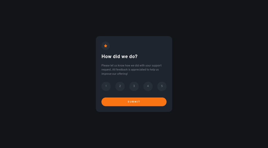
- The “icons/images” in this component serve no other purpose then to be decorative; They add no value. There
alt Ttagshould be left blank and have anaria-hidden=“true”to hide them from assistive technology.
More Info:📚
https://www.w3.org/WAI/tutorials/images/
- The proper way to build this challenge is to create a
formand inside of it, the “rating buttons” should be built using aninput radio(wrap all of them inside afieldset), since this will prevent additional buttons from being active at the same time, and it should have alabelelement attached to it for accessibility.
More Info:📚
MDN <fieldset>: The Field Set element
If you have any questions or need further clarification, feel free to reach out to me.
Happy Coding! 🍂🦃
0 - To not only improve your HTML code but to identify the main content of you page, you will want to wrap your entire component inside the
Please log in to post a comment
Log in with GitHubJoin our Discord community
Join thousands of Frontend Mentor community members taking the challenges, sharing resources, helping each other, and chatting about all things front-end!
Join our Discord
